Reading Lists
10 Book Designers Discuss the Book Covers They Rejected, And Why
A deep dive into the wrong turns of cover design

Have you ever bought a book just because the cover caught your eye? I have. I remember walking into the Strand bookstore and immediately gravitating towards Stephanie Danler’s Sweetbitter because the (now iconic) millennial pink cover stood out in a sea of paperbacks.
The book cover is the first thing a prospective buyer sees and a cover can go through multiple iterations before reaching the shelves of your local Barnes & Nobles. A proposed cover can be killed for a myriad of reasons: too gendered, too messy, too simple, too cliched and the list goes on. Using color, typography, and artwork, a cover has to be bold enough to attract attention and evoke the message and tone of the book at the same time.
I asked ten book cover designers about the evolution of their design process. These designers shared their rejected work with Electric Literature and elucidated on how the final cover best encapsulated the essence of the book. The rejected covers start on the left and the final versions are on the right.

Bullshit Jobs: A Theory by David Graeber
“[The book has] a great title and a simple but fascinating premise: the rise of useless, meaningless jobs and an argument against them. I wanted the cover to show how someone might occupy themselves at a bullshit job. Better yet, how might a creative person fill the day at a job that doesn’t allow self-expression. Having some experience with this, the design solutions were intuitive.
I liked the idea of the typography being made up of pushpins. The end result turned the commonplace office objects into something quite pretty but also begged the question of how many hours (many) and how much monotony (a lot) went in to assembling such a thing. As is sometimes the case, legibility was a concern. One criticism was that it was hard to tell what the pushpins were: ‘are they candy?’ Ultimately it was decided to go in another direction.
The crossbow was assembled using various objects from our office supply shelf. It was important that it only be made using items that are on hand in every office. I liked the imagery of some poor wage slave slinging handmade arrows into a cork-board in a desperate, maybe sophomoric attempt at entertainment. There was something rebellious about the idea of a weapon fashioned from office supplies — like staging a miniature coup. The placement and angle of the object over the type felt powerful and iconic like a crucifix.” — David Litman
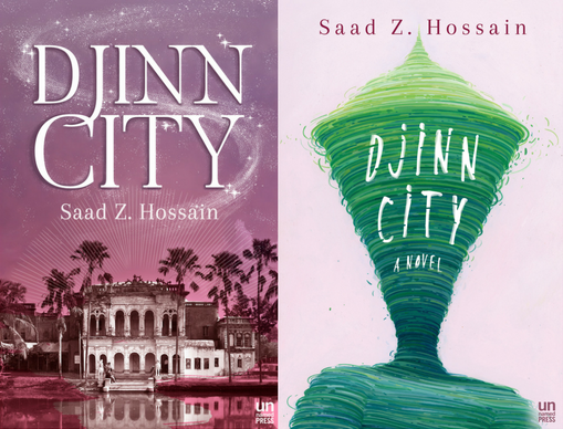
Djinn City by Saad Z. Hossain
“We had actually been using the original cover for quite a while, but when we were about to go into production on the galleys, we realized it wasn’t quite right. Djinn City is set in contemporary Bangladesh, and is a fantasy novel that addresses a lot of the challenges that the country is facing now and in the future, such as climate change and overpopulation. We needed a cover that felt much more modern, that also spoke to Hossain’s dark sense of humor and the wild adventure story that’s at the novel’s heart.
The original cover was too focused on the magical elements, which while are integral to the story, felt too rooted in tradition, and in the historical visions that the idea of ‘Bangladesh’ conjures. Saad Z. Hossain is part of the future of South Asian writing, not the past, and we needed a cover that reflected that. The final cover features art work by Brendan Monroe, an amazing artist we are really happy to work with.”— Olivia Taylor Smith, executive editor at Unnamed Press

The Motherhood Affidavits: A Memoir by Laura Jean Baker
“Some of the rejected covers for The Motherhood Affidavits were very beautiful, but they were either too gendered, too retro-looking, or just not tonally in line with the book. It has a lot of themes going on, so it was a struggle to represent them visually without it being too on-the-nose. There’s a lot to convey: motherhood, marriage, financial struggles, addiction . . .
We wanted a cover that could only be the cover for this particular book, and one that wasn’t too feminine because we want men to read it too. In the end, we went with this powerful image of a very uncute stork because of what a stork represents. A stork brings babies. But they’re usually depicted in a very cute and happy way. Our stork is a bit ominous, as though it brings more than babies, and leaves you wondering.” — Sarah Smith

The Most Fun You’ll Have in a Cage Fight: A Memoir/MMA Primer by Rory Douglas
“The book is based on a McSweeney’s column Rory Douglas wrote for two years about his brother Chad Douglas, a Boeing scientist and amateur mixed martial arts (MMA) fighter. As you might imagine, the story is brutal but filled with humor.
The first version emphasized the book as a memoir with the beat-up photograph of the two brothers. I liked the play between the word ‘cage’ next to the crib bars and ‘fight’ next to the two smiling baby brothers. But this isn’t a straightforward memoir, and the cover needed to reflect that.
We went with the guide-to-wrapping-your-hands concept because it played into the how-to aspect of the book — it’s a memoir and primer on fighting after all. The step-by-step layout allowed me create a grid (I love a good grid), which lent itself a balanced and striking design (see what I did there). I love the typography because the octagonal ‘O,’ ‘S,’ ‘C,’ ‘G’ call to mind a fighting ring. And, yes, in theory, you could successfully wrap your hands following the instructions on the cover.” — Olivia Croom
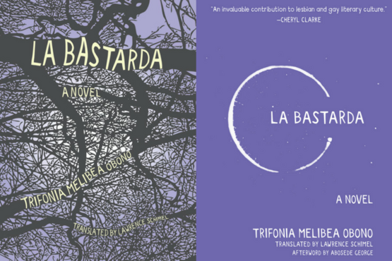
La Bastarda: A Novel by Trifonia Melibea Obono
“I strongly believe that voice and tone play significant roles in how book covers can effectively communicate a particular story. La Bastarda was presented to me as a coming-of-age tale set against the unique backdrop of Equatorial Guinea. The story focuses on an orphaned girl who enlists the help of village outcasts to find her father. The outcasts reside in the forest surrounding her village, and the forest itself is a point of intrigue and taboo activity.
With this in mind, I tried to put myself in the shoes of Okomo, the orphaned teen. I wanted to express, through her eyes, what this forest could look like to a young, impressionable, and curious girl. I rendered a cover from the perspective of someone looking skyward through the trees at night. We decided not to use this cover for concerns regarding legibility, as there is a lot of text that needed to be included (author and translator names, as well as the tagline ‘a novel’), but also because we thought that specific representations, whether it be a tree, a face, or specific renderings of type, could result in the cover falling into certain stereotypes about the region in which this book takes place.
The final cover design is an abstracted concept of the tone that I picked up on when I read the novel. I wanted to express a young woman coming of age and being brought into an inner circle of outcasts and finding her way. I treated the title, La Bastarda, as a character that slowly creeps into an opening in this circle of outcasts. Also, this design is much more minimalist than the forest design, and this simplicity allows for clarity, of course, but also diverse interpretations brought by the reader.” — Suki Boynton
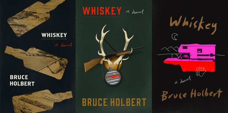
Whiskey by Bruce Holbert
“[The initial cover] was well received by the publishing house, and was only a few steps from approval. However, when presented to the author for a final vote something didn’t fit with his vision and it was vetoed. Perhaps the gun was too aggressive, or maybe there was an aversion to antlers, but in the end it simply wasn’t right and didn’t communicate the desired message.
The final version pulls relevant imagery from the story and is much more fitting as a whole. The RV is a prominent reference and very much a lens through which the story is told. Half submerged under the moonlight, it’s reflection reveals the underlying substance that toxically ties the family members together and symbolizes the fuel igniting antics between them.” —Tyler Comrie
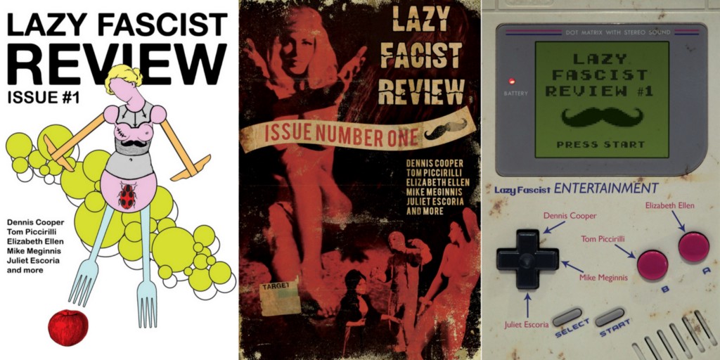
Lazy Fascist Review edited by Cameron Pierce
“The first rejected cover of the Lazy Fascist lit journal is an example of me designing something only I really like, but it was fun and I still love looking at it. When I was told it was ‘too weird to appeal to anyone,’ I designed a cover that leaned heavily on the sort of graphic conceits one finds in the design style associated with Italian exploitation films. While this was quite a successful design, Cameron was worried its appeal would be limited to those with an interest in Italian horror and escape the wider literary community.
We both agreed it was a good idea to use nostalgic connection to draw the eye of potential readers and making the cover look like a Gameboy seemed like the perfect solution. It appealed to the right demographic and was ubiquitous enough to have a wide enough reach. If you’re under the age of 35, who isn’t familiar with the Gameboy?” — Matthew Revert

The End by Fernanda Torres
“With the initial cover idea, we suggested the five aging friends in Rio de Janeiro — the first through five separate hourglasses, each standing in for a life lived colorfully — but run/or running out! (We particularly enjoyed building the title type out of the hourglass stands — the letters ended up looking a bit like bones.) The partially deflated balloons in the next layout were meant to suggest the end of a long and joyous party. With the third, we built a neon sign composed of colored bulbs at varying brightness — with some even burned out. And we paired these letters with neon angel wings as a nod and a wink; these men were far from angels.
The author was hoping for more tension between the title and the content. ‘The book,’ she reminded us, ‘has a very heavy title, but it is full of sex, humor, and bad behavior.’ She sent over some vintage carnival photos. She said, ‘I like the idea of having crazy, smiling people, at the peak of their happiness confronted with the fact that they will all face THE END.’ We were worried [using photography on the actual cover] might be too specific. It’s no fun for the reader when the cover designer shows you what fictional character(s) looks like. We turned up the photo of the young, handsome friends frolicking on Copacabana Beach that ended up on our final cover — a solution we really love.
Restless Books bravely embraced the limited color pallet and straight type treatment juxtaposed against all that Brazilian frivolity. Book spines can be a great space to have some added fun, so we introduced Copacabana’s fabulously graphic, wave-like street pattern and overprinted it with a neon yellow, so that it would glow in the bookstore.” — Charlotte Strick & Claire Williams of Strick&Williams
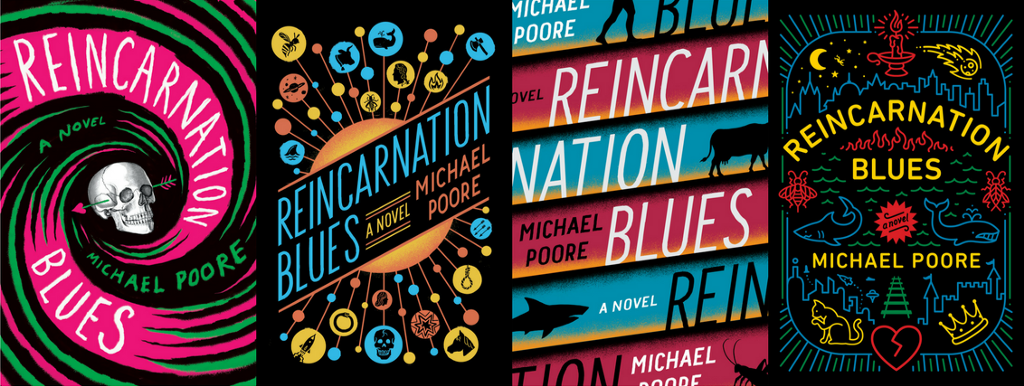
Reincarnation Blues by Michael Poore
“The novel follows Milo through many of his final lives (and deaths), so the sheer amount of imagery available to me was a bit overwhelming. The novel, taking full comedic advantage of the reincarnation cycle of punishment and reward, flings Milo back and forth between the far future and the distant past, and into the bodies of all varieties of animals and people.
For my first round of sketches, I tried to find the simplest way to communicate ‘cyclical death’— but in a fun way; ominous symbols like a gravestone and a skull, rendered in a bold and colorful style to reflect the story’s ‘lively’ approach to death. My other sketches went in a more literal direction, because when a story involves meteors, catapults, space ships, romance, and sharks, it would be such a waste not to at least try putting as much of that as possible on the cover.
As far as I know, most of these were well-received at the first cover meeting, but the more dense and detailed sketches were the clear favorites. However, they wanted to see a few more revisions without the skull and weapons (which were making it feel a bit too violent). Ultimately, the finalization process came down to deciding which of Milo’s many lives should be represented on the cover. In the end, we settled on a winning combination.” — Jim Tierney
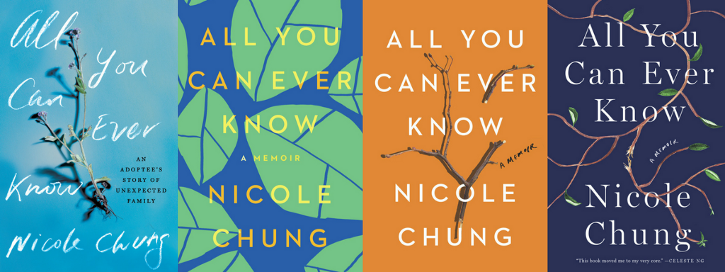
All You Can Ever Know: A Memoir by Nicole Chung
“The title, All You Can Ever Know, is a very luring one and I initially thought of a typographic approach. But as I started reading this book I began to feel how deeply rooted and raw the emotions in Nicole Chung’s writing was and I knew I wanted to use some organic imagery where it was both beautiful and broken. The images that came to mind had to do with the makeup of a “family tree,” i.e.: the leaves, branches, flowers, and buds. As I was doing some image research I found some photographs that captured the overall idea, but they felt too quiet and subtle.
We ultimately produced an illustration that is stark and evocative set against a midnight blue backdrop. The cropping of the branches as it trails off the page shows its crossover to the unknown and that it’s a part of larger entity. The branch intertwining in the title leading into the torn, loose branch reveals the depth and passage of the secrets, discovery, and untold truths in the memoir, which comes with the risks, discomforts, and loss. The torn, not yet broken branch indicated a disruption in the ‘family tree’ of losing one’s roots and the rediscovery to one’s identity, which is a central part of the memoir.” — Donna Cheng, Freelance Designer
“The earlier concepts that Donna had designed were conceptually strong and all had something we liked: the graphic treatment felt bold and like a big book but we felt they lacked an emotional component. We loved the use of the photorealistic branch and the soft changes in the background shadow that created some depth, but this cover had a self-help tone that felt limiting. Overall they each had strengths but were a bit too precious and incongruent with the author’s voice.
After the author had some more time to think about it, she began to question what the break in the branch might evoke about adoption. For her, adoption doesn’t mean brokenness beyond repair, or that lost family connections are beyond repair either — in many ways, the book is about how those connections and ties matter even when we don’t know how to name or talk about them. So we tried several versions and ended with one where the tendrils of the branch still make a connection with each other on either side. We needed to be sure that we were sending the right message about adoption, one that was positive so that this cover would honor Nicole’s experience and story.” — Nicole Caputo, Creative Director at Catapult