
interviews
The Fake Book Covers Going Viral on Social Media
Christine Rhee discusses her creative approach for marrying high- and low-brow in her popular design series
If you follow any writers or readers on social media, you’re probably familiar with the artwork of Christine Rhee. Earlier this year, I started seeing reposted images of Penguin Classics with quippy, tongue-in-cheek celebrity photos. A Property Brother on the cover of Dickens’ Bleak House. Julia Fox smiling maniacally on the cover of Bulgokov’s The Master and Margarita. A still of Dakota Johnson correcting Ellen Degeneres on The Ellen Show as the cover of Trollope’s Domestic Manners of the Americans.
Smart, hilarious, and all thanks to Brooklyn-based graphic designer Christine Rhee. For the last year, she has been working on a few different book cover design series, the most recent of which combines the aforementioned orange and black Penguin Classics jacket with celebrity photos.
I corresponded with Rhee about her book cover artwork via email. We discussed how she found her initial inspiration by loaning books to her friends, how she chooses the classic and contemporary literature she works with, and how our collective perception of books shapes her pieces. Rhee was also generous enough to share her favorite book cover designs from the series.
Ceille Clark-Keane: On your Instagram, it seems like the first fake cover is a recognizably contemporary fake cookbook with your (adorable) cat on the cover—but it also seems you were approaching covers playfully in earlier posts before posting the first fake NYRB covers of celebrity memoirs. What inspired you to start creating the fake book covers, and where did you start?
Christine Rhee: I don’t remember the first one, but I generally made them for friends when I loaned them a book. The first fake book covers were actual printed covers. I’m a designer, so I found that it was really helpful for me to make little design projects for myself that were fun and quick to knock out. It helps me a lot when I’m feeling stuck or blocked.
CCK: Does your design process differ when you’re creating a physical piece of art for a friend, as in these cases, versus when you’re creating an image for a social platform (and therefore primarily for digital consumption)?
I’m always interested in value aesthetics, what aesthetically makes us think that something is valuable or high brow versus what signals to us that it’s not.
CR: Not very much. The only thing that really changes is who the audience is and thinking about it as an image versus an object. I don’t do a lot in terms of setting it up as an image, it’s still very object driven. I want it to feel real, like I had just left the book on a table.
CCK: Could you describe your process for creating these covers? Do you have a complete vision for the series, like the Fake Books for Men and the Taschen art books, or do you start with a specific book? You’re clearly a reader as well as an artist, and I’d love to know how that informs this project.
CR: Generally, I think of it as a series first. When I start a series, I try to have some sort of thesis that I’m working through. I’m always interested in value aesthetics, what aesthetically makes us think that something is valuable or high brow versus what signals to us that it’s not. I like to pair two things from opposite sides of that spectrum and see what comes from it. The current series is obviously classic literature coupled with tabloid celebrity culture. The first books that I think of are ones that I think make good case studies. Sometimes, they’re books that I’ve read, sometimes it’s about how I think we collectively perceive a book, and sometimes it’s just a play on the title. I do like using popular books because they usually make great case studies. There’s more of a relationship there. The more obscure the books and the images get, the harder it is to see the thesis of the series.
CCK: The way the impact of the pieces hinges, at least in part, on collective perception of the book explains why the series feels at once accessible and like a reference in a TV show—it feels like you’re a part of an in-group who “gets it.”
CR: Thank you! The way I see design is that it is a visual language. We’ve all been trained to understand it, whether consciously or unconsciously. I am making the things I post sound very serious but I also really enjoy jokes and play. There’s no right way to engage or understand any of the things that I’m making.
I think of book covers as a movie trailer or a billboard. It’s to get your attention and get you to engage.
CCK: I wonder, do you notice trends in popular book covers, in certain kinds of classics, or in books by men versus women?
CR: Definitely. Sometimes it’s frustrating to me, and sometimes I think it’s my own biases. This is a bigger question than I think I can answer right now. A trend that I like right now, that I am seeing, is covers that are striking and/or beautiful in a way that feels new. It’s just an object that I want to acquire. I could stare at the cover of The Copenhagen Trilogy book for hours. The cover is by Na Kim. I’m obsessed with the collaging of the eyes. It’s so deceptively simple but so much is going on in that image. It’s brilliant.
CCK: How do you think the design and the packaging shape our collective perception of the works (if at all)?
CR: I should note that I’m a designer, but not really a book cover designer. I’ve never really designed a book cover that wasn’t for myself or a friend. I can tell you what I think, but it’s definitely an outsider’s/consumer’s opinion. I think of book covers as a movie trailer or a billboard. It’s to get your attention and get you to engage. It seems to be on a sliding scale on how much it relates to the book inside. This is not to criticize any designers—when the cover doesn’t relate, it seems very much on purpose, going after a specific customer. It does feel a little cynical though. The cover is part of marketing and trying to maximize sales, which doesn’t always speak to the experience of reading what was written. I would like to believe that the initial impression doesn’t sway my reading experience, but I’m not sure if that’s true for me. I think maybe other readers are able to ignore it.
CCK: What’s one thing you hope that viewers take away from your series?
CR: It shifts with time. In the beginning of a series, I hope viewers understand what I’m trying to do. Overall though, if you’re entertained or if you enjoy it, I’m happy. I can (and sometimes I do, unfortunately for my friends) speak endlessly on what I am trying to do, but once it’s out there, it’s not for me anymore.
Rhee’s designs are certainly out there—she has more than 5,000 followers on Instagram. But whether the pieces are ultimately for Rhee herself, or for her many fans, I was still curious about the designs she likes best. During our email exchanges, Rhee was generous enough to point to the cover designs in her series that she gravitated toward or enjoyed working on the most.
Here are a few of Rhee’s favorite pieces (plus a couple of my own that I couldn’t resist including):
Rhee points to this Murdoch cover featuring Ben Affleck, gazing at the ocean looking exhausted. (This checks out—odd to have no iced coffee in an Affleck tabloid photo.) “To me,” Rhee shared, “it’s the best example of what I had intended on doing. The later ones get a lot looser but that sort of always happens.”
In her Fake NYRB series, Rhee reimagines some amazing celebrity memoirs republished under the prestigious imprint, complete with the recognizable design. “Fake NYRBs was really fun for me,” Rhee said. “I did it during COVID lockdown and I got to e-meet and reconnect with a lot of people that I admire. NYRB was really good-natured about it.”
This is my personal favorite, and I had to sneak it in. The tabloid photo Rhee chose is Fiona Apple delivering an off-the-cuff acceptance speech at the MTV Video Music Awards, in which she told viewers that the world of fame is bullshit and not worth looking up to. Iconic, and an amazing choice for A Short History of the World.
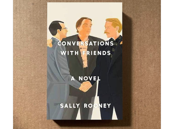
Rooney’s novel reimagined for men. I love how the color scheme isn’t completely different from the US cover of Rooney’s novel—yellows, browns, blacks. Rhee points to this cover as her favorite in the series. “For Fake Books for Men, Sally Rooney’s Conversations with Friends ended up being surprisingly silly. I’m always happy when that happens.”
A design series that engages so brilliantly with tabloid culture wouldn’t be complete without a Kardashian reference, and this one is amazing. The stark white background and black-and-white wardrobe in the photo Rhee chose makes sure the “little” women are front and center. I’ll leave you to consider who would be Jo.
If you’re interested in seeing all of the Fake Penguin Tabloid Classics designs, the Fake Books for Men series, and more, you can find and follow Christine Ree on Instagram @monobrow_ny.