Reading Lists
The Battle of the Book Cover: British versus American Edition
Join us in judging a book by its cover
We know, we know: you’re not supposed to judge a book by its cover. And yet, for as widely as the adage as used, we are all—whether consciously or subconsciously—judging books by their covers every time we browse a bookstore, or quickly scroll through a most anticipated list, stopping at the ones that catch our eye. Publishers put an awful lot of stock into book covers as well, following certain hot trends (cough cough, the Blob, cough) and moving away from others (such as photorealism having taken a backseat the past few years).
Whether we book people like to admit it or not, the cover is a very important part of a book’s perception, and so we here at Electric Lit think it’s a worthwhile endeavor every now and again to take the pulse of the public and see what aesthetic choices are making a splash, and which aren’t faring so well. Is the Blob still in, with publishers or the public? Is realism making a comeback? To test the waters, we asked our Instagram followers to choose between the UK and US book cover editions, to see what the hottest book cover trends are this year, and which trends are soooOOoo 2021.

Careering by Daisy Buchanan
There’s something similar going on between the two covers here: the shade of green, even the pink—which is only a flash of lipstick and nail polish in the U.S. cover, rather than the primary element of the U.K. cover—and a clearly at-her-wits-end woman, which perfectly resonates with this book about a woman who finally lands her much-desired dream job writing for a magazine, only to find burnout waiting for her there. And in a very interesting twist for our first battle, realism is the clear favorite! If you’ve followed our book cover battles in the past, you may know that realism has historically been the loser, so this clear sweep is a surprising start. Is this the beginning of a turning tide?
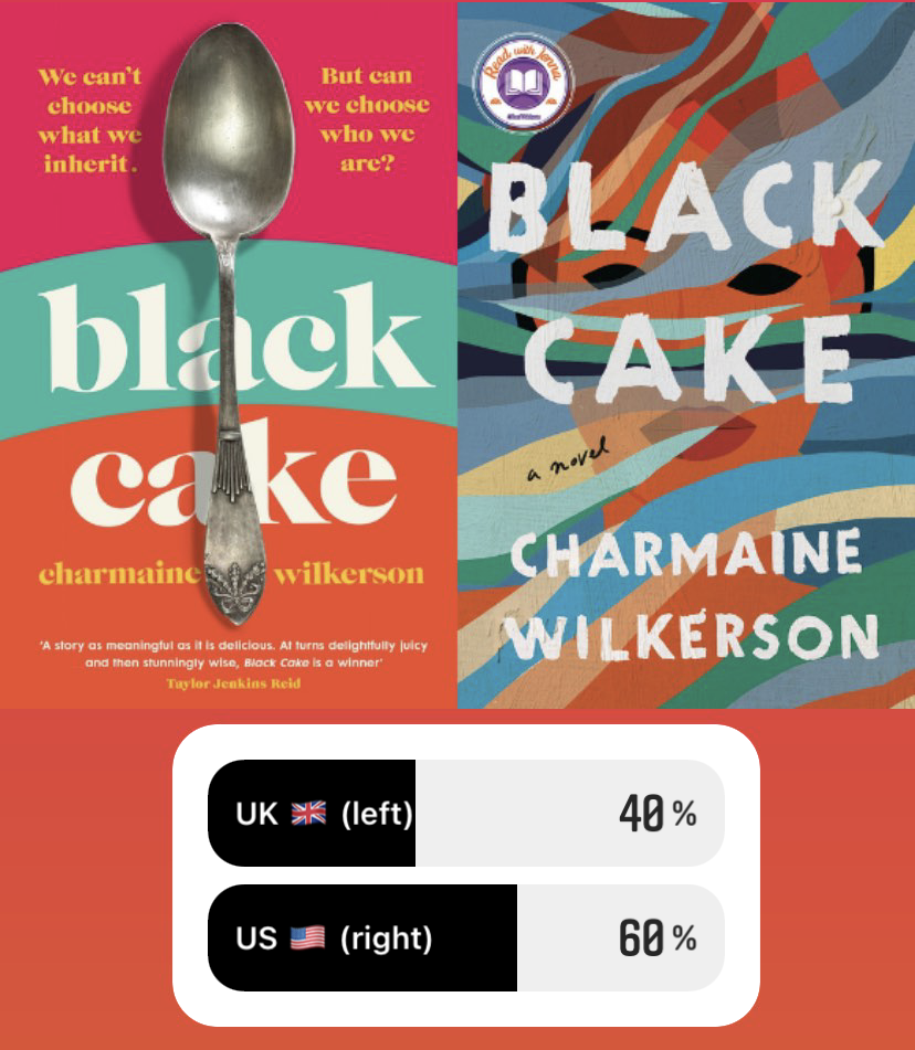
Black Cake by Charmaine Wilkerson
These two covers take different approaches to portraying this book about a mysterious inheritance a mother leaves her children: the U.K. cover opting to depict the more literal part—a spoon representing the physical black cake—while the U.S. cover chooses to depict the woman hiding behind secrets that are slowly uncovered after her death. The colorful swirls of the American cover feel very familiar—it’s sort of like those magic images where everything is a blur at first, but if you focus your eyes and stare long enough, the image beneath begins to appear. Comparatively, the British cover takes a more simplistic approach. Our voters, it seems, prefer the task of sussing out the secret inside swirls of the US cover.
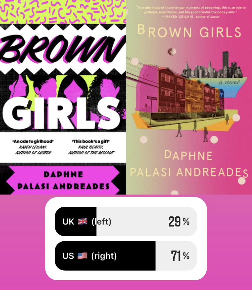
Brown Girls by Daphne Palasi Andreades
These two covers once again feature a similar color scheme, this time neon green and pink, but are otherwise entirely different: while the American cover is more focused on the book’s New York City setting, the British version is more interested in the protagonists: Brown girls from immigrant families who grow up together in Queens. Both covers are also doing a little juxtaposition: the U.K. cover’s zine-esque ’90s-style squiggles, varied fonts, and sharper hues, set against the silhouettes of grown Brown women is perhaps meant to reflect both the playful youth of their friendship set against the adults they ultimately become, while the U.S. cover plays with the difference between their original homes deep in Queens and the sprawling cityscape of Manhattan—which, while in the same city, feel like two entirely different worlds. In another upset, realism once again prevails with a U.S. win here!
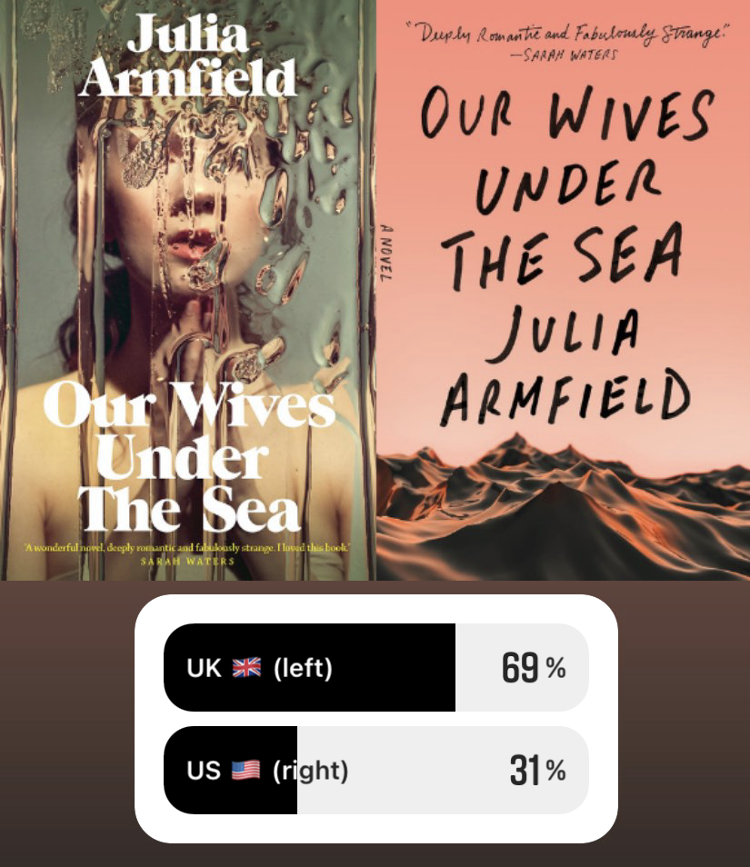
Our Wives Under the Sea by Julie Armfield
Both covers here have a focus on water, which is fitting for this book about a woman whose marine biologist wife returns from a deep-sea mission gone awry as a seemingly entirely different person. The U.K. cover layers water over the figure of a woman in a way that begins to blur her out, symbolic of the protagonist watching her wife become unrecognizable after her expedition. The U.S. version goes with a more simplistic portrayal of waves under a pink sky (which calls to mind the old sailor’s saying, “Pink sky at night, sailors’ delight. Pink sky in morning, sailors’ take warning”). The U.K. win is on-theme with the interest in photographic realism we’ve been seeing so far!
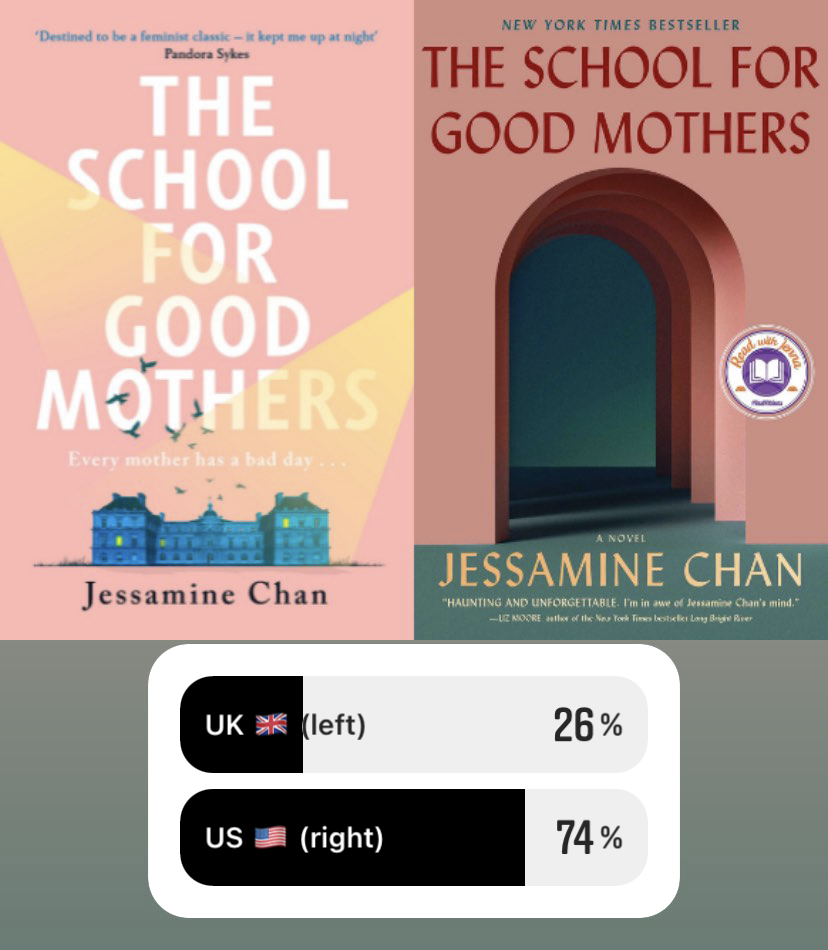
The School for Good Mothers by Jessamine Chan
Representing this smart, intense novel about a woman pegged by the government as a potential “bad mother” who may need to be sent to an institution that decide how fit of a parent she is, we once again have similar colors, different vibes. There’s something much more ominous about the U.S. cover’s shadowy doorways that draw you in and do justice to this book’s themes, and it seems that people responded better to the foreboding nature of the doors leading nowhere. The U.K. cover feels perhaps a bit too bubble gum—while it’s also representing the watchful nature of the institute with the shady building and searching spotlights, it doesn’t quite capture the mood the way the U.S. cover does, which our voters clearly responded to.
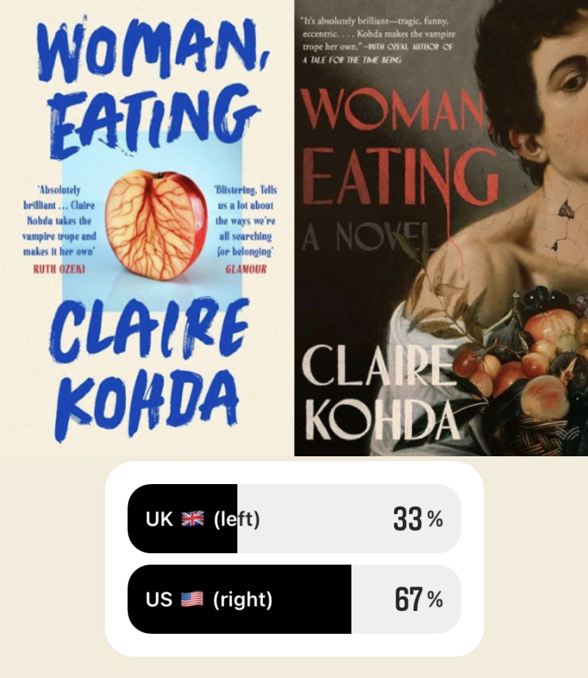
Woman, Eating by Claire Kohda
In a battle of minimalist vs. maximalist realism, the maximalist wins out with the gorgeous U.S. cover that simultaneously evokes the art, hunger, and vampirism of the novel itself. The U.K. cover gets points for the peach, whose red veins feel distinctly bloody and do the work of evoking Kohda’s vampire protagonist’s hunger for both blood and human connection at once, but I have to agree that the U.S. cover is doing something special here. It’s not often that a book cover hits so many of a book’s themes so perfectly, while also being gorgeous, eye-catching, and quite unique. An impressive feat and well-deserved American win!
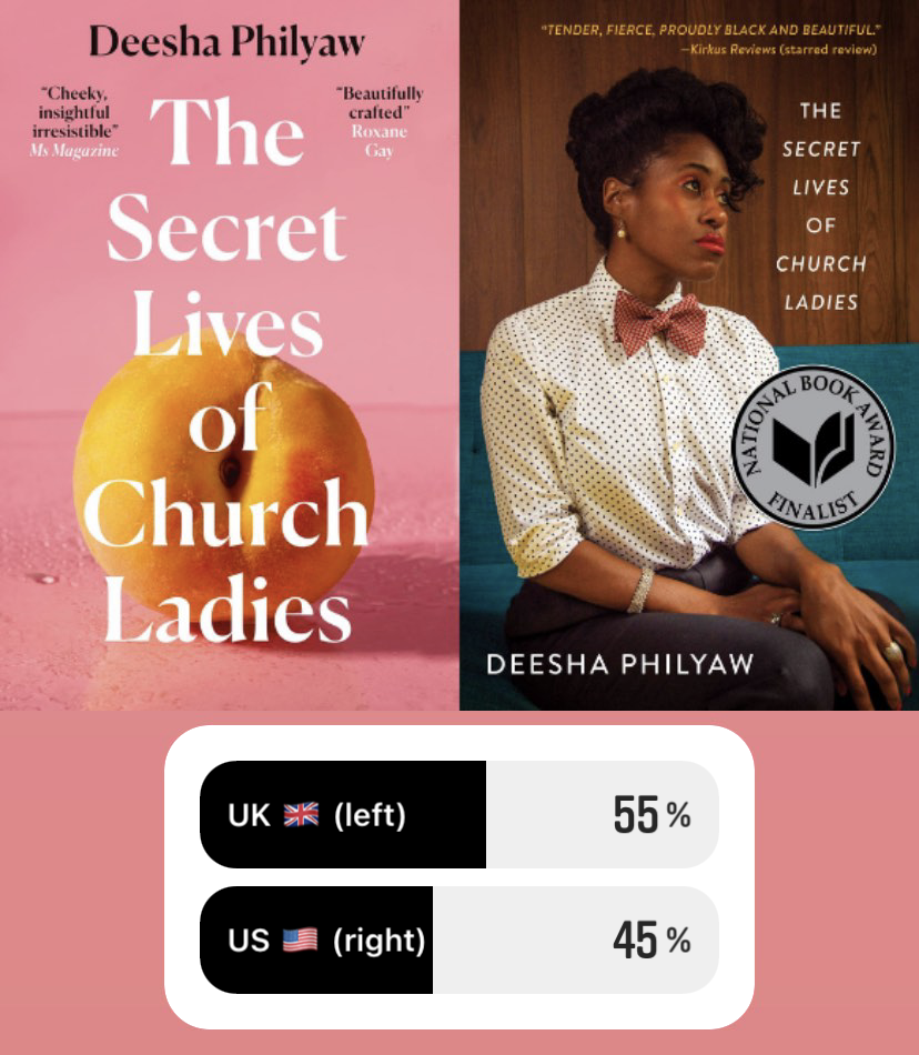
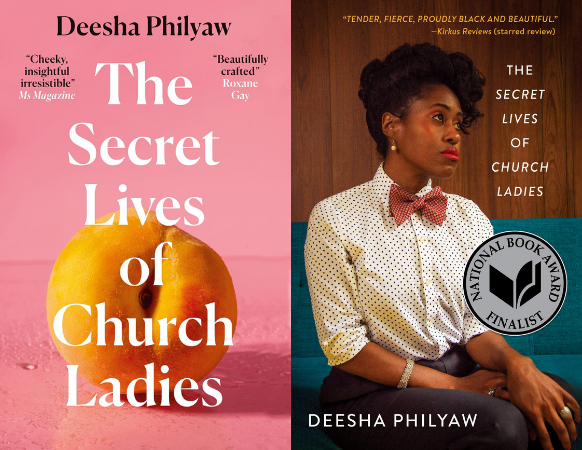
The Secret Lives of Church Ladies by Deesha Philyaw
I suppose peaches are having a hot moment in the U.K. right now? And while it was less successful for Woman, Eating, for Deesha Philyaw’s short story collection full of Black women who are struggling to reconcile their own needs and desires with those of the church, the peach resulted in a successful win here, though not by a particularly wide margin. A significant percentage of voters still liked the U.S. cover’s depiction of a church lady herself, but not enough to win against the humble peach. Pink also seems to be having a hot moment in book covers, so it’s possible the color scheme was the real kicker here!
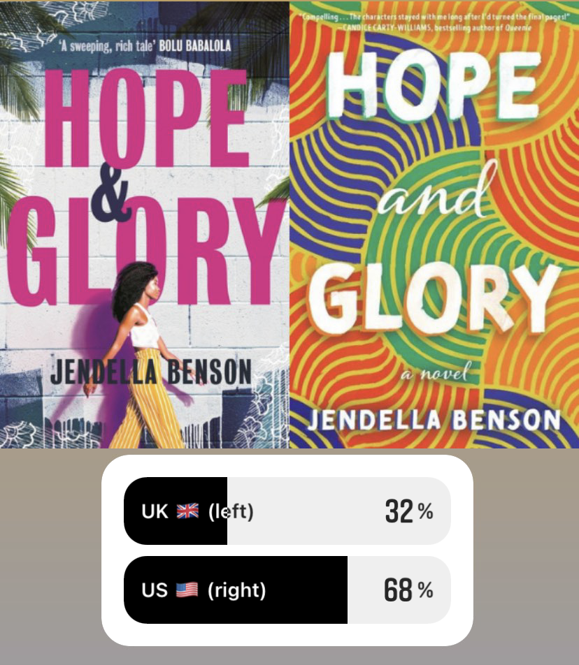
Hope and Glory by Jendella Benson
We haven’t seen a lot of abstract colors in this batch (it seems we’re trending away from the abstract), but the Blob makes a reappearance on the U.S. cover of this book about a woman who returns home to London from Los Angeles after her father’s death and is faced with the messiness that comes with reuniting with her family. It seems the Blob still has some sway with the public, as the colorful, ambiguous swirls of the U.S. cover took the win by a significant margin over the U.K.’s realist depiction of a woman crossing in front of a brick wall. Perhaps the bright blob-ishness, which feels like a callback to the book covers of yore (and by “yore,” I mean just a few months ago), sparked a bit of nostalgia within the new swath of realism.

Booth by Karen Joy Fowler
You’re seeing it here for the first time folks: a true 50/50 split! This is especially interesting, given how completely differently these two covers approach Karen Joy Fowler’s sweeping fictionalization exploring the family of John Wilkes Booth. Here, the U.K. cover opts for a simple color sketch of flowers and birds over a dark purple backdrop, with a singular snake looping through the title. The US cover is doing something entirely different (and quite unique!), with artwork that looks almost like it belongs on a box of deck of playing cards or an old timey cigarette box, with two distinct bullet holes punctuating the title (no explanation needed for that part). For whatever reason, these two covers representing the historical Booth family have equally struck a chord with our voters.

Young Mungo by Douglas Stuart
Young Mungo brings us back around to the battle of photorealism vs. photorealism, and for Douglas Stuart’s much anticipated sophomore novel of an intense and dangerous queer romance set in Glasgow, the U.S. cover wins out. Both covers feature anonymous male faces, with the American version evoking some level of trouble and sadness, where the British is more focused on desire. It seems our voters preferred the slightly more dour of the two. Come on, y’all, are we not here for two men going at it on a book cover? No love for a sexy, unapologetically gay romance cover? Are readers simply not interested in seeing people making out on book covers (disagree, but alas, I’m merely the microphone, not the decider)? Either way: horny cover out, ambiguously sad cover in.
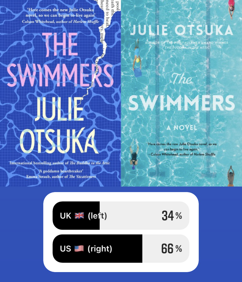
The Swimmers by Julie Otsuka
The American cover swept the competition for Julie Otsuka’s novel about a group of swimmers whose routine is disrupted when the pool they frequent is closed due to a crack in the bottom and the realities they are forced to grapple with when their escape is gone. This is a bit surprising, given how similar the two covers are when you break it down: both are blue covers with water on the front, but it looks like the voters were drawn more toward the classic chlorinated pool shade of the U.S. cover, which also features the swimmers themselves, over the U.K.’s darker, more interpretive design, which represents the crack in the pool itself.

The Colony by Audrey Magee
The theme of covers doing vastly different representations with similar styles continues with the artistic, painting-like brush strokes on both covers of Audrey Magee’s The Colony, about a painter who travels to a small Irish island from England for inspiration, a Frenchman who frequents this same island to study the language and people who live there, and the people who call this place their home. It’s no secret why both covers adopted the feeling of a painting, as a clear representation of the painter himself. While the U.K. cover went a bit more simple, representing a minimalist depiction of a small island in a large and lonely sea, the U.S. cover—which more of the voters responded too—depicts both the island and, it seems, the erasure of the individuals who live there by those who are attempting to depict them.

Anonymous Sex edited by Hillary Jordan and Cheryl Lu-Lien Tan
Fruit-based covers are really having a moment it seems, though for this anthology of 27 anonymous sex stories that leaves you to guess which beloved author wrote what, featuring writing by Rebecca Makkai, Helen Oyeyemi, Jason Reynolds, and Téa Obreht, among many others, the strawberry butt was not preferred. The people have spoken, and they’re done with sexy fruits. No more fruit butts! Fruit butts out, sexy Rorschach in (is the Rorscach sexy? Is this my subconscious seeing lots of people doing it on the cover? Someone call in a professional).
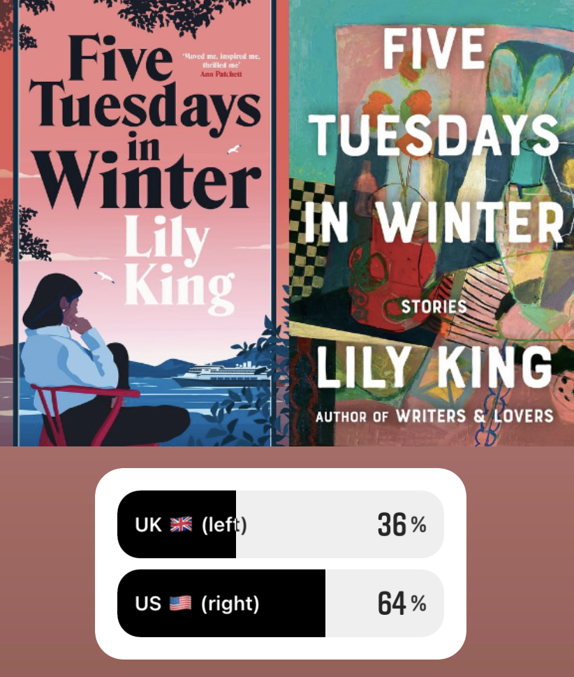
Five Tuesdays in Winter by Lily King
Ambiguous colors once again take the win with Lily King’s Five Tuesdays in Winter, a short story collection that takes an intimate look at the pain and love of unforgettable characters. It’s not quite the Blob, and more like an abstract still-life painting with a respectful nod to the Blob’s love of striking colors. Either way, the British cover’s more cartoonish cover of a woman contemplating by the water (featuring even more pink) seemed to draw the eye less than the brightly cluttered American edition.

New Animal by Ella Baxter
Another very close call here, with the U.S. barely eking it out! More photorealism and more pink are featured in these two colors, and the pink wins out for this book about a woman who, after a loss, skips out on her job painting the faces of the dead for their funerals, and explores her body’s grief through BDSM. Though by a very slim margin, our voters appeared to prefer the colorful U.S. cover that contrasts with the black-and-white woman swimming to the U.K.’s up-close depiction of a woman who looks as though she’s falling asleep at her desk, or just bored-as-hell, with the smeared lipstick of someone who’s had a long night (perhaps a subtle reference to doing the makeup of the dead?).

Checkout 19 by Claire Louise-Bennett
While both covers here are opting for an abstract art-feel, as we’ve seen time and time again, the voters prefer a flash of color to the U.K.’s black-and-white. The story of a girl whose world revolves around writing and reading, which examines what it means to understand yourself and your life through the lens of both creating and consuming literature, the U.K. cover might be a more direct depiction of notebook scribbles with a woman at the center of it all, it’s just a real uphill battle when you’re up against abstract colors. I’d also like to point out here that it seems like brush-stroke covers are very in right now!

True Biz by Sara Nović
Okay, I lied: black and white can win against colors, and does here with Sara Nović’s True Biz, about a residential school for the deaf that explores the worlds of the students and the hearing, CODA headmistress. Both designs take a literal depiction of sign language by featuring a hand on the cover, but the U.K. cover’s more serious, photographic depiction of faces within the hand, drew more people in than the colorful and playful U.S. version in this case. This begs the question: do we just love a serious cover over a playful one? Something a little more intense? Is colorful > plain, but sadness > colorful? Much to consider!

An Olive Grove in Ends by Moses McKenzie
The simple, cleaner U.K. cover won by a mile for Moses McKenzie’s story of a young Black British man who gets tangled up in a dangerous situation while trying to find a way to leave the neighborhood he grew up in with his childhood sweetheart. While the U.S. cover is evocative, with a bit of a graffiti feel that may be meant to represent the neighborhood in Bristol where the story takes place, the U.K. cover is a bit less busy and easier to read, and the circle containing and eye and colorful clouds elegantly depicts the protagonist’s dreams of a better life.
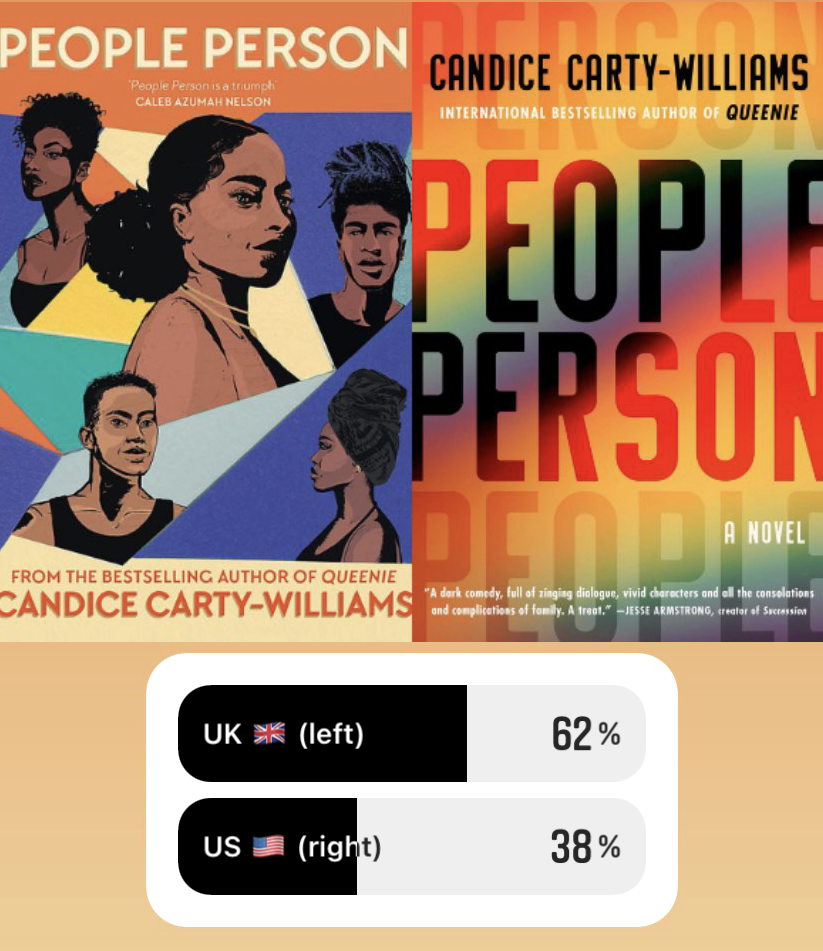
People Person by Candice Carty-Williams
The U.K. cover’s win for People Person feels a bit surprising here, as drawings of people have typically been a losing cover design thus far. For this story about a woman who suddenly finds herself back in close contact with her distant half-siblings, it might just be the perfect cover. While the U.S. cover takes the colorful route, it avoids taking any sort of abstract shape, which may be the factor in losing here. In general, it’s seemed that the color-based covers only win if there is some sort of shape—not necessarily the Blob, but something your eye can catch onto. Something to take note of, publishers!

Notes on an Execution by Danya Kukafka
Maybe I’m biased here as someone with a deep love for foxes, but I personally am shocked that this was such a close one. I mean, it is a fox. A very cute—if slightly ominous—fox gracing the cover. The U.K. deserved a greater sweep here, if you ask me. Though maybe the U.S. cover gave that sweet little fox (sorry, am I making my favoritism too clear here?) a run for its money because the broken locket on an evocatively looping cord is a more direct representation of this novel that investigates a serial killer set to be executed through the eyes of the women who surround him and the detective who hunted him down. Fair enough—the U.S. cover is great too! And perhaps I shouldn’t be so obsessed with the cover of a book about a serial killer being extremely cute. But sorry, it’s cute. I love it. It wins with the audience and in my heart as well.