interviews
The Story Behind the Most Haunting Book Cover on the Shelves
The author and designer of ‘Her Body and Other Parties’ discuss what went into creating the cover
Carmen Maria Machado’s debut collection Her Body and Other Parties has been shortlisted for the National Book Award, and readers everywhere are talking about her intricate stories. Machado’s collection is dark, disturbing, sensual and sexy. Her work refuses to fit neatly into a category, and includes elements of psychological realism and science fiction, comedy and horror, fantasy and fabulism. In these eight stories, fables and classic fairy tales mix with a meditations on Law and Order: SVU, Girl Scouts lost in the woods, and a liposuction procedure.
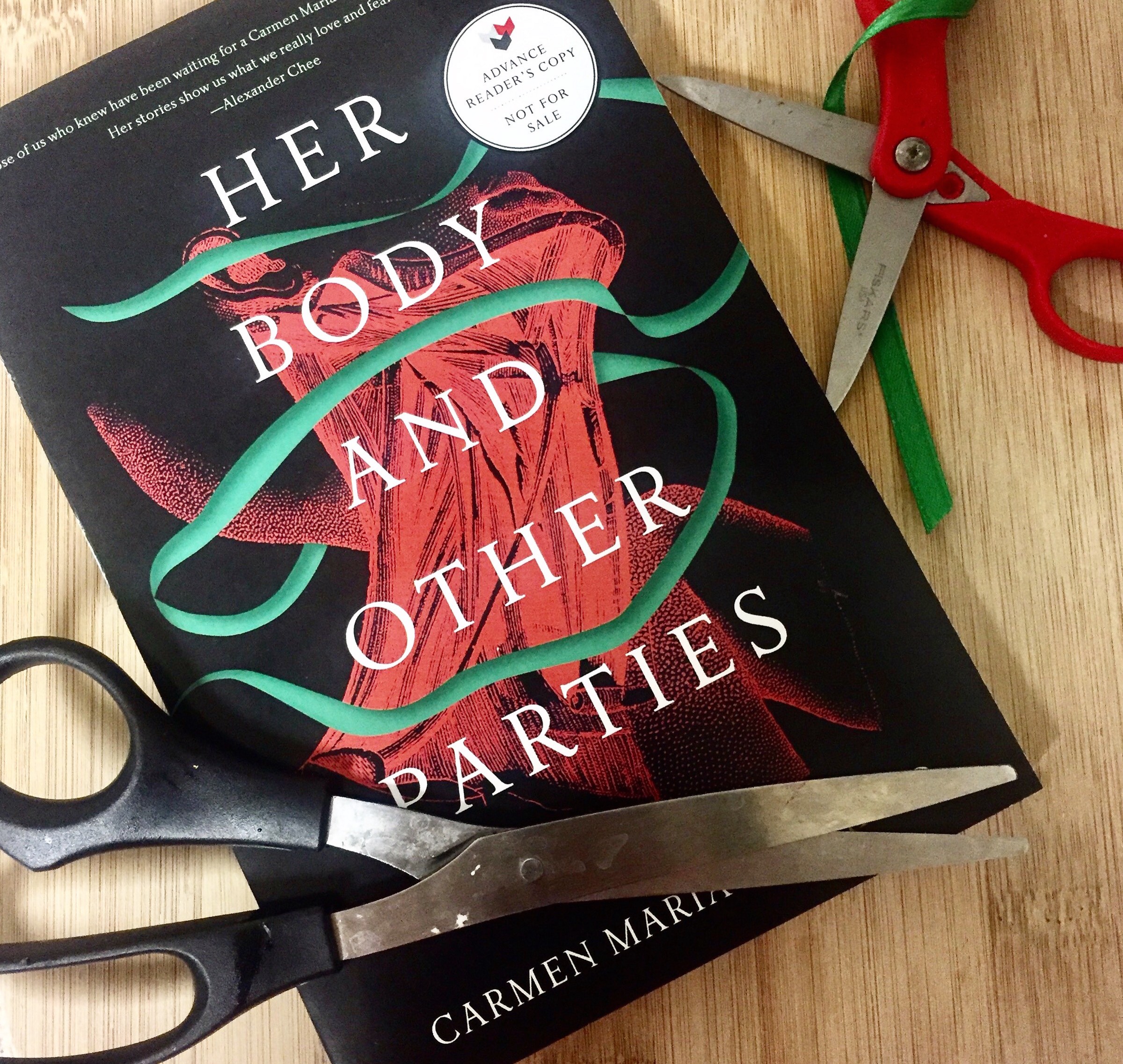
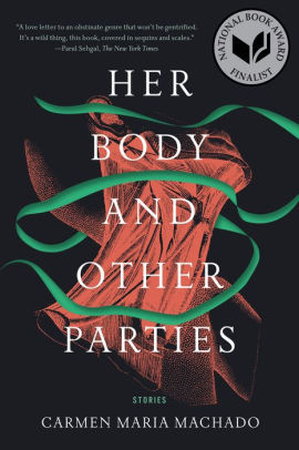
The cover for Her Body and Other Parties picks up and intensifies the ambiance of the book. Kimberly Glyder, who has created numerous covers for Graywolf, Scribner, Little Brown, and more, captures Machado’s unique voice with a striking and sinuous image. Her design captures the simultaneous violence and sensuality in Machado’s work, in which women’s bodies both desire and disappear in fantastical and disturbing ways.
I talked to Machado and Glyder about the process of creating the cover, and in the process, discovered that this beautiful image has a secret.
Liz von Klemperer: What, if any, were your expectations for the cover?
Carmen Maria Machado: I had a Tumblr that I put together of visual inspiration, so when the time came I sent it to Kimberly. I also filled out a questionnaire my publisher gave me that included key words, images, and things I absolutely didn’t want on the cover. I suggested the colors black, white, grey and green because of the green ribbon in the first story, “The Husband Stitch.” In terms of themes, I just wrote “women” and “queer women,” and then I suggested the image be mid-century to modern, but the book isn’t really time period–dependent.
LVK: What were the things you absolutely didn’t want on your cover?
CMM: I said “no dudes!” for obvious reasons. Nothing pink or girly either. I just don’t think it would be appropriate for the tone of the book. I also wanted to avoid women with Spanish fans, or salsa dancers. Nothing like that. I’ve noticed this happens a lot with women of color, and it just wasn’t what the book was about. I wouldn’t want that imagery on my book just because I happen to be Latina. They also asked for word associations and I said dark, moody, sexy, sensual, erotic, haunted, physical, death, ghost, decapitation, mouth, lips, organic, and sex at the end of the world.
LVK: Wow, that’s pretty thorough! Could you talk more about being apprehensive about your book cover being too derivative of your identity as a queer, Latina woman?
CMM: It’s complicated because booksellers want to sell your book, and obviously writers have their own ideas about what their book is about. My wife is a publicist, and we talk a lot about selling a book and packaging it for sale, and it’s an interesting dynamic between what’s going to sell and what’s not. A problem that happens a lot is that the people who want to sell your book want it to be pinkish or girly. I know Asian women take issue with publishers who put an Asian fan on the cover. So I’m really sensitive to imagery that is drawing on stereotypes or pat imagery that connects to the author’s identity, whether it’s gender or race or anything like that. For me luckily it wasn’t an issue with Graywolf at all, but I do know cases where that is a problem with the publisher, and I feel really grateful that I didn’t have to deal with it. But I was worried about it enough that I felt the need to mention it.
LVK: What was your first reaction when you saw the cover design Kimberly made?
CMM: She sent me two different covers at first. I had mentioned in the questionnaire that the image of the ribbon around the girls’ neck was unique to my book. I also mentioned the image of ghosts with bells in their eyes, which is from my Law and Order story. We ultimately chose the first option I mentioned, but with different colors. The black background was originally coral and green, and there was also pink and orange. The option we scrapped was a watercolor image of a woman’s face with bells for eyes. The watercolor image didn’t resonate with me, but I loved the other one. I wasn’t sure about the colors, though, so I threw it into Photoshop to mess with the colors and I realized I liked a dark background with a green ribbon. I sent that back to the publisher and suggested the color change. They made the edit, and I loved it. It was pretty low stress, compared to experiences I’ve heard with other publishers!
A problem that happens a lot is that the people who want to sell your book want it to be pinkish or girly.
LVK: Many of your stories feature women who disappear. I’m thinking specifically of “Real Women Have Bodies,” “Eight Bites,” and “Especially Heinous.” How did you go about envisioning these bodiless characters, and what that process was like?
Carmen Maria Machado: The imagery in “Real Women Have Bodies” is pretty straightforward. That story started with the play on words in the title, which is real women have curves. But what if real women just have to have bodies? What if the physicality of a body was validated someone as a “woman?” What would happen if women started to lose their bodies? There are actually a lot of moments of physicality in that story. For example, the moment where she looks through her fingers and she can see her bones. I was thinking about being a kid and putting your fingers on a flashlight and seeing your flesh glow orange though the shadow of your bones. That’s where the image of seeing through yourself came from.
I just read Roxane Gay’s new memoir Hunger, which is about how fat people are highly visible and completely invisible, and it really resonated with me as a reader and as a fat woman. It’s very strange. Women’s bodies are both put on pedestals and scrutinized down to every detail, but also we are blacked out of various conversations and elements of culture. That’s true of all women, and I think when we look at different iterations of non-white women, of queer women, of fat women, there are all these ways in which things are complicated. I feel that that state of being scrutinized and invisible is an incredibly real way to think about gender and the body in our current situation and probably forever. I think that’s why that imagery pops up.
LVK: Yeah, the cover really does justice to that idea. As in, how do you depict a body that’s disappearing? I love how Kimberly’s illustration is a red corset, cinching a waist. The green ribbon is loosely coiled around it, which to me indicates absence and empty space.
CMM: You know it’s also a neck, right? If you look at the illustration it’s actually a lower part of a jaw and the muscle of a woman’s face. But it also looks like a corset. That’s what’s so amazing about it! It’s so good!
If you look at the illustration it’s actually a lower part of a jaw and the muscle of a woman’s face. But it also looks like a corset.
LVK: Wow! I see it now!
CMM: Yeah, it’s inspired by an old medical illustration and turns into an optical illusion. It’s either a neck with a jaw but it looks like a corset and the ribbon is either being tied or untied, which is unclear, which I really like. There’s a lot coming out of it, you can read it in a bunch of different ways and it has so many dimensions.
LVK: Thanks for clarifying, that adds so much to the image. Is there anything else you’d like to add?
CMM: I’ve always loved collaboration and other artists working from my words. This is a really cool example of how that worked beautifully.
Liz von Klemperer: I talked to Carmen yesterday and she said in the Graywolf author questionnaire she mentioned words like dark, moody, sexy, sensual, haunted, physical, death, ghost, decapitation, mouth and lips. How do you interpret such disparate images?
Kimberly Glyder: I was struck by the medical image I found because the woman is looking up, exposing her neck. It has a sensual feel to it but it’s also quite haunting and spooky. I’m usually not entirely literal and also try not to be too conceptual. Words like “haunting” and “decapitation” might not draw a viewer in, and I’m specifically trying to look for visuals that will be beautiful or at least engaging on a cover. I want to intrigue people, but don’t want to scare anyone away. I thought that this image is a nice balance between all of the words Carmen mentioned. Originally I’d had a line across the throat, which I turned into the green ribbon, which I think is more evocative and beautiful.
I want to intrigue people, but don’t want to scare anyone away.
LVK: I originally thought the image was just a corset, and then Carmen pointed out that it’s also a neck. That took me a minute to figure out, and I like that it’s not immediately apparent, and that you have to mull it over.
KG: Yeah, I think that that’s an interesting way to look at the cover because, like her writing, it is nuanced and can be interpreted multiple ways. There’s a lot of raw, graphic detail in her writing, so to me this diagram is a pretty interesting take on that.
LVK: The book in general is so dark but there’s a delicate aspect to it that I see translated on the book cover. How did you balance those two tones of the book, and translate violence and the sensuality so effectively?
KG: Going into the book I was prepared for a disturbing read, because the questionnaire Carmen filled out was very dark. I was surprised, though, by all these moments of sensuality. Specifically the story the cover is based on. The ribbon is tied around the woman’s neck, and there’s something that’s very, as you said, delicate about that. So I was trying to find a balance. I wanted people to be drawn into the imagery, but not be literally scared off. I didn’t want it to look like a certain kind of genre, and I really wanted it to be open enough for people to be curious but intrigued enough to buy and read the book.
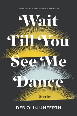
LVK: I also read Deb Olin Unferth’s Wait Till You See Me Dance, and the cover you created for that collection is distinctly different. It’s more paired down and simple, and has a different vibe. How do you bring your own style to book covers while giving each one a unique look to it?
Kimberly Glyder: The thing about Graywolf books is that they’re all so incredibly diverse and interesting. There are so many visuals I can pick up, and I look at every book as a completely unique project with a completely unique style. A consistent through line in my work is that I do a lot of hand lettering and drawing, but I do try to approach each project as a unique challenge.
LVK: What’s a common challenge that you come up on when you’re designing book covers?
KG: It’s very different and depends on the publisher. I had a great relationship with Graywolf because they fit me with the right books, and I also think that they trust me as a designer and trust my part in the creative process. Other publishers try to do this, but there are a lot more people weighing in in terms of sales reps and marketing people. It can get very difficult the more people are involved. It can really strip down your design sometimes. Most of my Graywolf covers have been chosen as-is and they go out in the world and they’re exactly how I would hope they would be.
LVK: It sounds like the process of designing a book cover is fairly collaborative with the artist, author, and publisher weighing in.
KG: When I do book covers I look at the information that’s given to me but it’s also very much a solo project, and I don’t think of it as collaborative. I’m just given a manuscript and a lot of publishers don’t give you information from the author, so many times I have nothing, I’m just told to design the cover. Although it feels like a solo process, I am always thinking about the buyer and about how people will engage with the cover either if it’s online or in a bookstore. I want it to be engaging enough that they will want to pick it up. So in that way I am being directed, but I’m also outside of the publishing process. My personal work consists of drawing and painting, and it’s exclusively my own and not something that I’m being directed to do.
LVK: Is there anything else you’d like to add?
KG: I had a great time working with Carmen, and I’m excited to hear what she has to say about the process!