


Reading Lists
10 Rejected Book Covers That Almost Made the Cut
Designers talk about the planning and thought that goes into the cover design process

We’re back with our rejected book cover series, where designers walk us through the process and show us the book covers that could have been. (For previous entries in this series, see here and here.) What kind of planning and thought goes into the cover design process, and what beautiful art gets dropped along the way? The rejected versions start on the left and the final covers are on the right.
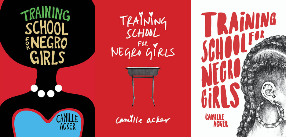
Training School for Negro Girls by Camille Acker
I was immediately taken with this debut collection of short stories, which details the lives of black girls and women who are all living, learning, and finding their own distinct ways in Washington, DC. Each story confronts difficult themes of gentrification, race, respectability politics, and femininity with nuanced grace, warmth, grit, and humor. Once I put the manuscript down, I knew that the design for this cover deserved the integrity and poignancy that the brilliant author, Camille Acker, instilled into all of her characters’ unique albeit pervasive truths. This was no easy task, and the design went through multiple iterations before I literally went back to the drawing board and came up with an illustration that would ultimately become an integral part of the final cover.
Everyone appreciated the initial designs, the first being a stylized silhouette of a black woman with an afro wearing pearls. This spoke to the theme of gaining respectability, a challenge that many of the characters are confronted with, but we all agreed that this initial concept didn’t truly speak to the collection as a whole. The second concept was more abstract, with that D.C. red becoming the central focus. The girl’s handwriting that I used for the titling seemed a tad too earnest, and the distressed school desk seemed like a step backward in terms of what the stories were trying to convey. In summary, it just wasn’t fresh enough.
After several more versions were presented, the author suggested that using a representative image might be a more successful approach. I was nervous about putting a representative image on the cover for many reasons, but after several discussions with the author, editor, art director, and publisher of FP, we came up with an illustration that—paired with edgy, hand-rendered type—we all agreed sensitively and successfully captured the integrity of the characters’ definitive experiences and lent truth to the author’s exceptional, and empowering voice.—Suki Boynton
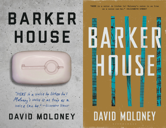
Barker House by David Moloney
The novel details the work and personal ongoings of several guards at a correctional facility. As a former corrections officer, Moloney makes a fascinating contribution to our understanding of the criminal justice system through profiling the complex power dynamics and invaded boundaries between inmates, guards, and their family members—everything from the seedy and obsessive to the mundane and domestic is painted in this unsentimental portrait of an often invisible society.
One of the initial designs that we were excited about features a soap bar with a cuff key-shape carved out of it. This conceptually spoke to two incidents in the book. The first was a scene wherein a guard squishes the intricate figurines that one inmate carves out of his soap. It encapsulated this tension between hope and hopelessness that is perpetuated inside the prison and the twisted mental games played. The second incident involved a guard misplacing his key. As the facility is thoroughly searched, another guard grapples with whether to slip the guard his spare key to rescue him from consequence. It was a quiet internal dialogue speaking to how one can be both inclined to protect and abandon peers in the name of self-satisfaction. There was concern over the alternative connotations of a soap bar in male prisons as well as an overall desire for the cover to more immediately communicate the book’s setting.
Prison bars were favored imagery to pursue, but the editor and myself were cautious about how to portray them as we wanted to convey that the story was told from the perspective of narrators that freely moved in and out of confinement. Additionally, Barker House does not have barred cells, so I wanted to avoid misrepresenting the setting. The final cover uses graphic bars that under and overlap the title, suggestive of the guards who monitor and feel monitored. The collaged textures atop the bars depict the various vantage points of the novel. We tried many color palettes, but ultimately felt that the muted mustard and turquoise felt truest to the poignant literary tone of Moloney’s voice.—Tree Abraham
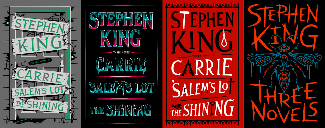
Three Novels by Stephen King
Designing one book cover is hard. Designing one cover for three books is a unique challenge, especially when they happen to be three of the most famous horror novels ever written. My first instinct was to use an image common to all three stories: the corruption of “home.” Salem’s Lot and The Shining both feature once-grand buildings occupied by evil forces, and much of the horror in Carrie stems from an abusive and isolated home life.
I also presented some lettering-based alternatives, with small icons from each story worked into their respective titles. My Art Directors felt the boarded-up door was a bit too childish, so I came up with some lettering-based alternatives with small icons from each story worked into their respective titles.
The third cover were sent to Stephen and his Agent, who felt they were a bit too busy. They asked me to try two simplified extremes: either pure horror lettering, or one large illustration. Also, they wanted to use “Three Novels” instead of individual titles on the cover. I went full ’80’s-slasher-VHS-box-art for the lettering, and chose the iconic bucket of blood (Carrie) and zombie wasp (The Shining) for the illustrations.
The wasp sketch was approved pretty quickly, but not before someone (I’m not sure who) decided to revert back to individual titles. On the plus side, the huge size of this edition allowed me to put a blood-bucket on the spine.—Jim Tierney
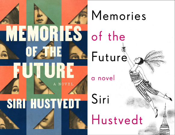
Memories of the Future by Siri Hustvedt
Memories of the Future is a provocative novel about time and perception presented through a notebook chronicling the narrator’s first years in New York City. In the notebook, the narrator obsesses over and constructs the life of her next door neighbor, Lucy Brite, so my initial instinct was to portray a woman at various angles through peepholes of sorts. I discovered a detailed pencil drawing of a lady while walking my dogs and thought it suited perfectly. Alas, this direction felt too science fiction for the author and in the end, we went with a piece of art she provided for the final cover.—Christopher Lin
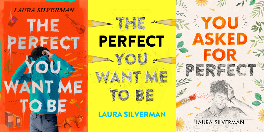
You Asked for Perfect by Laura Silverman
Lately I’ve been working on a lot of young adult fiction and I love it! These projects often give me the opportunity to work on both illustration and design together. This particular novel is a timely story about academic pressure, struggle, and self-discovery. We meet the protagonist in his senior year as his grades start slipping. Ostensibly he is the perfect Harvard applicant, but secretly his academic perfection is falling apart.
In the first concept, I really wanted to communicate the external pressures he was facing, and how he was trying to hide from it all. To achieve this, I created a messy oil painting feel, inspired a little by David Salle’s work. This felt too busy and also didn’t convey the uplifting message of the book. My second approach was mostly type-driven with an over-used broken pencil trope. We liked the type in this one and ultimately it led us to the final design.
At this stage of the project there was a rework of the title. The new title was more succinct and allowed for more art with less type. To tie in the pencil sketched title, I created an illustration of the protagonist in a stressful moment. Erasing his face allowed for some visual ambiguity, and also stands as a metaphor for his personal struggle and self-discovery. The color and illustrations around the border give the feeling of the positive journey he ultimately goes through.—Philip Pascuzzo
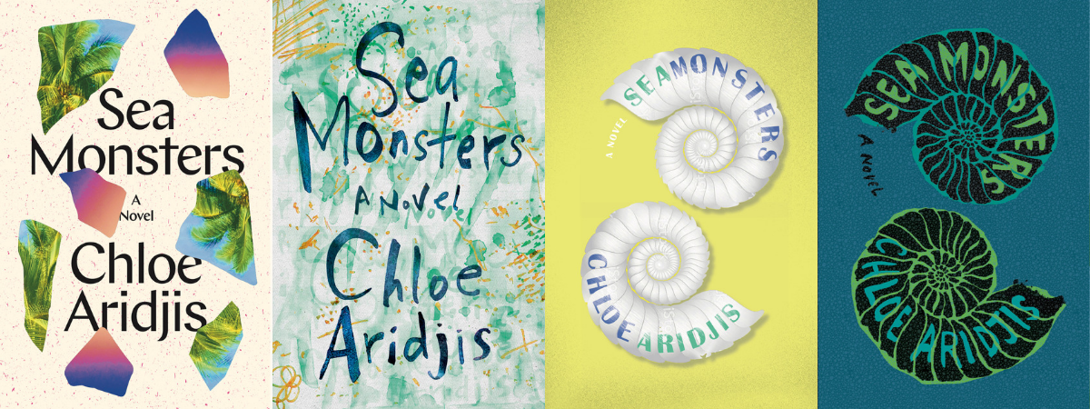
Cover design by Charlotte Strick and Claire Williams of Strick&Williams for Catapult. Click on image to enlarge.
Sea Monsters by Chloe Aridjis
Sea Monsters is a hypnotic novel set in 1980s Mexico. Luisa, the restless teenage protagonist, runs away to the beach town in Oaxaca, with a mysterious boy who seems to offer an escape from the monotony of her everyday life. Once there, these two drift apart, but both are caught up in the undertow of the shoreline’s listless vagabond culture:
We found inspiration in this richly observed passage: “Others said Zipolite meant ‘Lugar de Caracoles,’ place of seashells, an attractive thought since spirals are such neat arrangements of space and time, and what are beaches if not a conversation between the elements, a constant movement inward and outward.”
Early on I had the idea for the double nautilus in conversation, going so far as to doodle these two shells, yin yang, in my notes, but Claire and I didn’t immediately jump to our ink and brushes, and instead we pursued other ideas at the studio that eventually lead us back to where we might have started.
A New Wave soundtrack plays throughout the novel on Luisa’s Walkman, and we looked back at those ’80’s album covers for inspiration. On one jacket comp we scattered beach fragments, shapes that reflect back an overly saturated beach landscape of hot pink sand grains and leafy palm fronds. These fell over large angular typography. By a later round, we’d discovered the powerful work of Brazilian artist, Mira Schendel. Catapult’s Art Director, Nicole Caputo, agreed that Schendel’s naïve making was indeed the right tone for Chloe Aridjis’s novel. Out came our markers and stained papers which we layered together to suggest the overlapping of messages left by sand and sea. The impulses here were right, but we were still missing the inherent darkness of Luisa’s journey.
We looked back through our original sketches, seizing again on this idea of the two nautilus shells—two shapes, standing in for figures—trying to make sense of one another and attempting to relate. We studied the detailed 18th-century illustrations of philosopher/naturalist, Ernst Haeckel, and made a digital sketch from stock art of similar 3D, pearly-white nautilus shells against a shocking yellow background. Although the composition was right, these shells were too perfect to represent Aridjis’s characters or evoke the right mood. This led us to make the inky shells that made their way onto the final jacket. We layered in a hand-painted seafoam pattern that Caputo suggested we print as a blind spot gloss. This special effect really pulls the whole seductive package together.—Charlotte Strick

Homesick by Jennifer Croft
We had originally intended to use one of the photographs from the book, because Jennifer Croft interweaves images throughout the narrative. While beautiful, and referencing the sister relationship that’s at the core of Homesick, this didn’t capture how unique the book really is. I had this marbled paper saved on my computer for awhile, I always loved the colors and was waiting for the right project to use it. When we decided to veer away from photos for the cover it came to mind: the soft, vague but brightly colored shapes floating in a “sea” of blue reminded me of memories. I fractured them by cropping the image a couple of times and layering them on top of each other. I put the typography in a cream-colored box because I wanted it to feel more like a journal or diary, something totally intimate.— Jaya Nicely
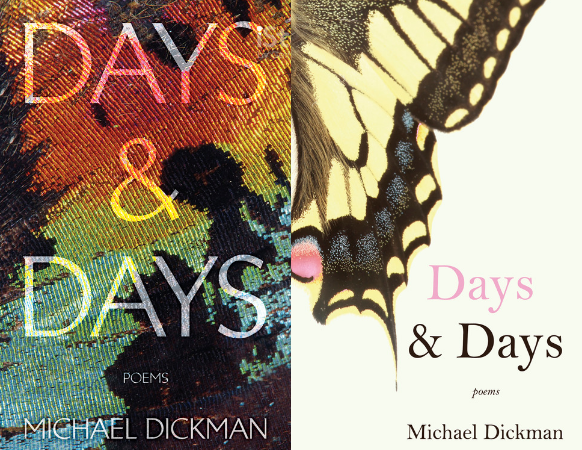
Days & Days by Michael Dickman
Michael Dickman’s latest poetry collection plays with, among other things, man-made versus natural color. Butterflies wing past graffitied walls surrounded by flowers. I wanted to capture that and play with hard and soft textures on the cover.
The photograph for the concept cover is a detail of a swallowtail butterfly wing. The editor and author liked this concept, especially the butterfly hair and neons, but felt the color palette was too close to his previous covers. That was particularly funny feedback because I purposefully hadn’t looked at his previous collections while designing.
Swinging in a different direction, I found an image of a swallowtail with more muted colors and even more butterfly hair. The softer image called for a change in typography, and I used my personal favorite typeface, Bell MT. To maintain the play with textures, we printed the jacket on glossy paper and put spot matte on the butterfly and type.—Olivia Croom
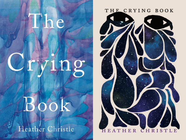
The Crying Book by Heather Christle
The Crying Book needed to evoke a sophistication, and not feel too weepy or sad. Heather Christie is a celebrated poet so I also wanted to make sure the cover would appeal to her devoted readers and perhaps expand her audience further. I had sent over three directions in the first round, all in varying shades of watery blues with clean classic typography similar to the cover on the left, plus a version of our final design with darker tears and an olive green background. Some of our team members liked the version of the design that ended up being tweaked for our final very much, but the author and some team members felt all of the designs were too gloomy for a book with this title and a bit too dark. I usually don’t get too attached to covers, mostly trusting the process and knowing that sometimes the collective feedback pushes a designer or myself to some new brilliant solution, but I was a bit heartbroken in this case as I felt the cover overcome by tears was so perfectly suited for the material and that the strong graphic style of the illustration would garner attention.
It was decided that some new concepts were needed. The author loved vintage mid-century modern textbooks and this aesthetic could signal to the reader that this subject of tears and crying was well researched so I designed a new round along those lines. I also decided to send the project out to one of my favorite designers to see a fresh perspective and presented those options to the author as well. Heather was so happy to see these and did like some of them but after some time she came back to one of the original designs where the tears take up the entire cover. I brightened the background color to a rich cream and made the tears a bit more vibrant. When I created this artwork, I felt the abstract shapes did not instantly imply tears but created something new as well. Other inspirations behind this design were the descriptions the author provided: being engulfed by tears, one’s self becoming tears, the body’s physical reaction when crying, “the most painful point of mourning at the most abstract moment,” tears as stars in the night, and filling an Olympic pool with 55 tears from each person. What a beautiful book that was such an honor and a joy to work on.—Nicole Caputo
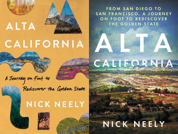
Alta California by Nick Neely
Alta California is the chronicle of Nick Neely’s journey through a 650-mile trail from San Diego to San Francisco. His path—laid out in 1769 by a Spanish expedition—stretches through the Golden State, taking him through cities, fields, and forests. This design was a challenge for me since I have never been to California. I had to condense all the wonder that the author felt about the state and his journey onto the cover—a long hike through a part of the country I don’t really know!
My first attempt to distill the author’s journey into symbols that you would find on a map (included are symbols for river, mountain, etc.), while incorporating photographs of the stunning range of Californian nature. I was also a fan of the collaged look and wanted it to have a kind of hand-made pieced-together feel since the book is really the author’s travelogue. Eventually, this was deemed too abstract and too focused on nature (the author treks through many urban areas as well), but I am still so fond of it!
Eventually, we landed on using a 1908 Carl Christian Dahlgren oil painting of historic San Francisco that accurately reflects the combination of the book’s exploration of Californian history and landscape. Whereas the map symbols were visually appealing, this cover conveys more about the book. And now I definitely want to visit California!—Sarah Brody


