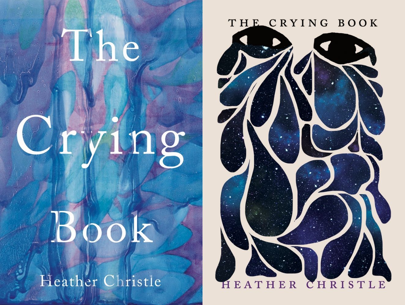
Reading Lists
What 11 Books Looked Like Before the Final Cover
Book cover designers discuss their rejected false starts

Admit it, you’ve judged a book by its cover. We all have. After all, the cover is designed so that a casual peruser at the bookstore with a quick glance understands the gist of the book. A good cover subtly conveys what the book is about, enticing the reader to pick it up and thumb through the pages.
I asked nine designers to discuss their use of typography, artwork, color, and illustration in visualizing the theme(s) of the book and why previous versions didn’t work. Note: The rejected versions start on the left and the final covers are on the right.
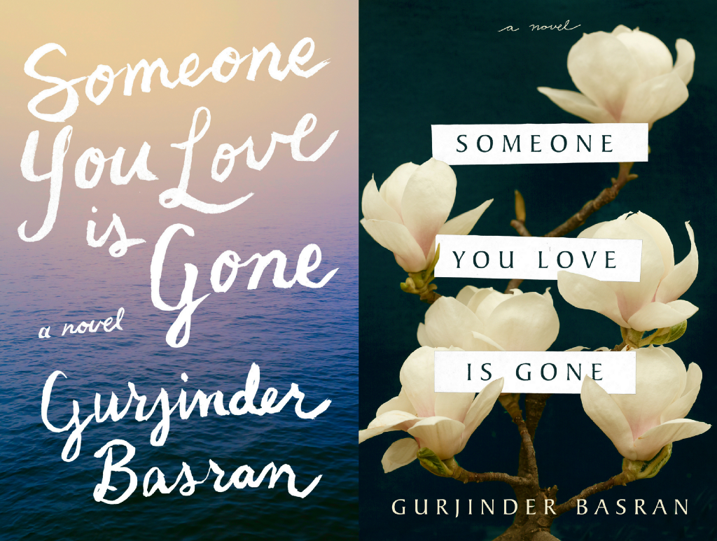
Someone You Love Is Gone by Gurjinder Basran
As I was designing this cover, I was struck at what a quiet, poetic story this was. The book is a narrative about a family and a meditation on mourning a loved one, so I wanted to make a cover that was really beautiful and soft. The first cover was well received and I really enjoyed doing the hand lettering on it, but the lettering seemed a bit too whimsical for this book.
I parsed through the manuscript again and pulled out an image of these white magnolia flowers at the loved one’s funeral, an image that seemed perfect for a book cover. The strips of paper that the title is on is unique to the novel as well, so I sat in the office one morning and cut up little strips of printer paper that I scanned into Photoshop. I liked the idea of the flowers as this symbol for someone who isn’t here anymore, while the strips of paper belong to a character who is very much alive in the story. The final cover didn’t take a long time to get approved. I think that I really understood what the publisher and author wanted and was able to pull together something that was quiet but beautiful and not too sad looking. — Sarah Brody

Contact Light by Madina Malahayati Chumaera
When we first started reading the book, we fell in love. Curiosity about outer space has been intrinsic to humankind, expressed through prose and poetry, Madina writes with such grace and maturity that perfectly captures the feeling you get when you look at the night sky, overwhelmed with how vast the universe and how small a human is. We immediately thought of star constellations and how they tell stories of relationships with other humans and with the nature.
For the first draft, we put together some illustration of girls floating in the sky with stars on their body. We then decided that the cover didn’t reflect the childlike excitement and curiosity for the universe quite enough. We turned our focus on a young, impressionable girl, flying towards “the great unknown”. We explored with several colors, imagery and media, using
watercolor, pencil, and digital illustrations to express the grandeur of space. Grey and reddish orange felt too dull, turquoise too bright — until we found that dark purple, a combination of the stability of blue and the energy of red, perfectly capturing the nuance of the book. On the center, we strayed away from realistic objects and played around with abstract lines and shapes to leave you wondering — and hopefully, wandering. — Genta & Ndari of sukutangan

Movers and Shakers: Women Making Waves in Spirits, Beer & Wine by Hope Ewing
We initially conceived of a cover that was more directly recognizable as a cocktail book, with a classic Prohibition-era aesthetic that featured silhouettes of contemporary women. Our art director Jaya Nicely is also a fantastic illustrator, so anytime we can have her do some original illustrations we try to take advantage of that. We wanted something that would feel weighty and serious, and speak to the fact that the women featured in the book are at the top of their game and incredibly important figures in their respective fields.
The first cover never felt quite right, and looked too much like a recipe book, so we decided to look for photographs with movement and color. Jaya found this photo by Oriana Koren and everything clicked. The Prohibition Era was a hostile time for women, and the current cocktail culture inspired by it is hyper-masculine, even codified by mustaches and suspenders. The cocktail in Koren’s photo has a very west coast vibe: it uses fresh fruit and botanicals, and while it’s pink, it’s clearly made with beet juice rather than grenadine. The final cover represents a women-led future for cocktails, one that is inspired by nature as a lot of the women featured in the book are champions of biodynamic processes and respect for terroir. — Olivia Taylor Smith, Executive Editor at Unnamed Press

Whiskey When We’re Dry by John Larison
This wasn’t an easy book to package. The story is about a tough young woman who disguises herself as a man to search for her outlaw brother. It’s set in late 1800s America, but I didn’t want it to look like a straight period piece. My initial designs were gritty and graphic. I liked the idea of showing all the different levels of terrain and wilderness she covers on her adventure. This direction went over really well in-house, but the author felt it was too ‘small-literary’. The in-between rounds were rough because there was a lot of uncertainty on how to position the book. How Western should it feel, should it feel Western at all? We looked at paintings, photographs, horses, no horses, figure, no figure, etc… There was a very particular balance we needed to hit that just wasn’t happening.
Ultimately, the direction I was given was to go pure mood/atmosphere. I found a photo that had a similar composition to what I was going for in the beginning and colorized it as a sort of hazy sunrise/sunset and that did the trick. The final cover was just the right combination of big, warm, Americana that doesn’t give too much away, and doesn’t pigeonhole the book genre-wise. — Colin Webber

What Should Be Wild by Julia Fine
This was one of those situations where I read the book and absolutely loved it, which can sometimes make designing the cover rather tricky! I had a lot of strong ideas that didn’t always match what the editor or author’s vision was. What Should Be Wild is a dark, magical, moody story. Think mansions and dark forests and girls with strange powers, so I originally wanted something like the first cover here. A female figure shrouded in branches and leaves really resonated with me personally, but unfortunately, a lot of people who saw it thought that it was too creepy and off-putting. The second cover here was almost approved! I was lucky enough to find this image of a tree growing from a heart which again, really exemplified the story (in a less scary and more metaphorical way), but was kicked back in the end probably because it wasn’t as accessible an image to the audience that we wanted to reach.
The cover that got approved was luckily my favorite of the bunch, and I actually did it towards the beginning of the whole process. The type was originally an elegant serif font, but I updated it because this story is a modern, feminist fairy tale. We see a lot of books with flowers on the cover recently, but what about dead flowers? I loved this image because it was beautiful and spoke to the themes of life, death, and resurrection in this book. Some gold foil was added to the cover for some extra magic and voila! a cover that really represents this book in a way that I am so proud of. — Sarah Brody
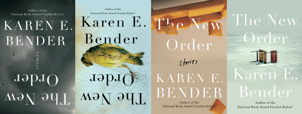
The New Order by Karen E. Bender
The New Order is a collection of stories that boldly examines the changes in our country over the past 2 years. Karen shines a spotlight on violence including a school shooting, bigotry, sexual harassment, and the emotional impact of living under constant threat. This was an emotionally charged project for me, one that made me question my role and my responsibility as a designer in addressing some of the dark problems we are facing in our society, and how to do so with sensitivity and thoughtfulness.
The image used on the final cover of the fallen chair was found during my first round of photo research, but I had set it aside. At the time I was concerned that the image would be too upsetting to parents who had lost children to the rampant school violence our country was experiencing.
I began designing some versions that felt very safe by using more abstract imagery to communicate the general concept of people reorienting themselves as the world they know recedes. Typography placed upside down or on its side was a favorite for a few of us but made the marketing and editorial team nervous. The design using the photograph of the bird with legs entangled in a net represents the children affected by school violence in their very own classrooms and the powerlessness of the parents. It was thought that this image may upset readers enough that they would avoid picking up the book. The upside down couch representing the safeness of home and what is known with pillows falling haphazardly felt too light and too playful.
Post presales, I picked up the project again to work on some additional options and while in the middle of rereading the manuscript, on February 14th, seventeen people — fourteen students and three staff members — were fatally shot and seventeen others were wounded at Stoneman Douglas High School in Parkland, Florida. This image that I had found early on which I had set aside I now urgently felt I had to use. I felt almost a responsibility to create a design that called attention to the tragic societal issues and to personally pay tribute to the lives of the students and staff members lost.
The final cover is a minimal quiet hauntingly spare design with white type and the overturned desk chair speaks loudly in honoring the lives lost, calls attention to the overall message of the book and the tragedies in modern American life today and connects deeply to the sadness many of us feel over what is happening. — Nicole Caputo

Something Wicked This Way Comes by Ray Bradbury
I was really excited to work on this reissue of a classic Bradbury novel, a darkly poetic story about a malevolent traveling carnival. So much amazing imagery to draw from.
The editor wanted to see a version that paid homage to the first printing of the book which had illustrated typography rising and twisting in a spectral shape. My idea was to try to emulate this but have it feel “real” rather than illustrated. I actually got a projector and tried casting the type on various irregular surfaces. This wasn’t working, so I found a bendable mirror (think carnival fun-house) reflected the type and photographed it. The result was probably a bit too experimental and legibility was challenging. The other comps told more what the book was about.
Everyone liked the carnival ticket idea but wanted something more akin to the reissue of Bradbury’s Fahrenheit 451. Matt Owen’s (truly awesome) design has a more graphic and less photographic style. I was inspired by Coney Island’s iconic grinning clown face. From this I developed the illustration of Mr. Dark, the evil carnival owner of the novel, in a design that felt like it could be a poster for Mr. Dark’s Pandemonium Shadow Show. The Bradbury estate felt that the face too closely resembled the Guy Fawkes mask adopted by protest movements. Now that they mentioned it, yeah, I could see that.
I found the lettering for the final cover in a book of old typefaces. The caption for this set read “Alphabet cut in bone by French prisoners of war; Napoleonic Wars.” Cool. I manipulated the type in a kinetic style that I had seen in my image research. This one felt congruous with the Fahrenheit 451 cover and the Bradbury estate approved. — David Litman
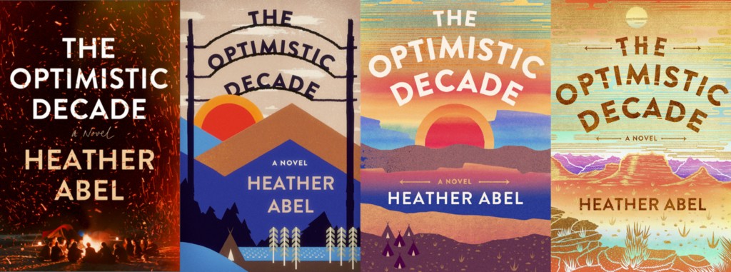
The Optimistic Decade by Heather Abel
The Optimistic Decade is a sweeping debut novel about the bloom and fade of idealism set at a utopian (back to the land) summer camp (Camp Llamalo), located on an idyllic mesa deep in the Colorado Rockies. The novel follows five campers and their charismatic leader over the span of the 1980’s/1990’s.
Initial direction was to focus on the summer camp, so the first round of comps explored photographic solutions that involved community at night around a campfire. But the location of the camp was central to the story as was the era, and the campfire could have been anywhere at any time — and seemed anything but optimistic, so these did not go forward.
New direction was to focus on the camp and the landscape graphically. So, the next couple comps with waxing/waning suns are based on WPA era posters and look remarkably like the graphic on the author’s favorite 80’s mug (which she sent as inspiration). In a few versions we added a dude ranch arc for the title. These were not well received at the cover meeting — they felt dowdy when the goal was to convey a feeling of nostalgia while creating a jacket which stood out among other contemporary fiction on the shelves.
Finally, Utopia! I created an illustration of a mesa using the fantastical colors of a radiant golden sunset. We arched the type to give the nostalgic feel of the camp sign. The printed book feels great with a gritty surface. There is no gold ink involved, but the cover feels laced with light. — Philip Pascuzzo
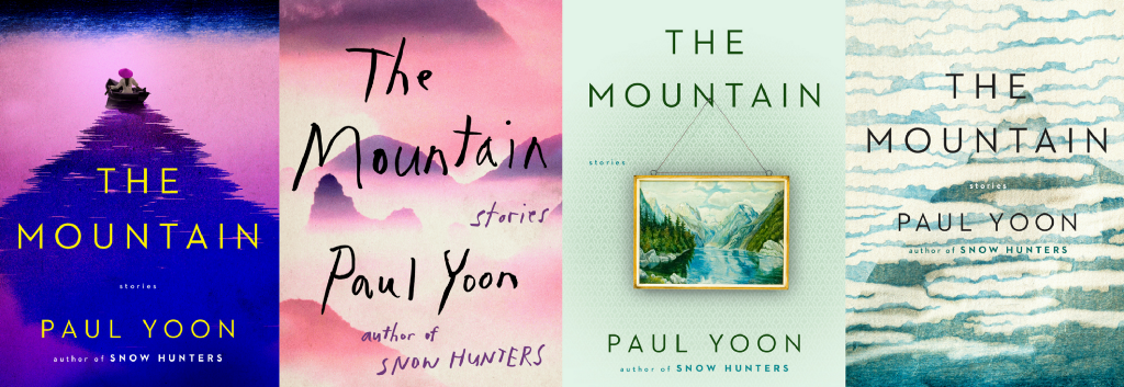
The Mountain by Paul Yoon
The Mountain is a hauntingly spare and ethereal collection of six thematically linked stories by award-winning author Paul Yoon. I had the pleasure of working with Paul on his first novel, Snow Hunters, and I definitely wanted the two packages to complement each other in order to build upon Yoon’s distinctive brand of prose.
My first approach was a mirror image of the cover for Snow Hunters, with the human element at the top and the landscape at the bottom. I wanted to evoke the looming sense of a mountain, which is a common thread throughout the stories, in the wake of the boat.
Ultimately, although the title story references Shanghai, the imagery was too specific to a particular time and place and was not universal enough.
In the subsequent rounds, I decided to omit any suggestion of a figure and focus on the idea of abstracting a mountain. The final cover successfully captures the nuanced layers of Yoon’s writing and was broad enough to tie the six stories together in a cohesive package. — Christopher Lin
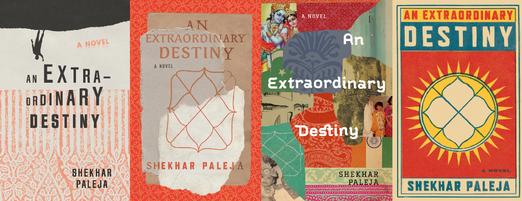
An Extraordinary Destiny by Shekhar Paleja
The book threads together stories of three generations of an Indian family, moving back and forth through decades and characters and the complicated confluence that a changing nation, cultural and familial expectations, and trauma has on their realities.
The initial direction I took based on the publisher’s suggestion centered on a small silhouetted character reaching for his grand destiny in the sky. This felt too generic for the rich Indian history and character dynamics in the novel, so in the second round I focused on illustrating the layers of time and how they interweave into a singular narrative. We really wanted the cover to feel Indian, so loads of exploration with rich wood stamp patterns and mixed media collage.
In the end, the publisher decided they wanted something more simple and graphic, very keen on a matchbook style. In my experience because Canadian literature occupies a small portion of the books on store shelves, and is competing with larger international bestsellers, the design really needs to be straightforward and attention-grabbing and there is often less room to experiment with quirky design. Nonetheless, I was excited to mimic the stylings of vintage Indian matchboxes which are all timeless with primary colors, bold type, and confident illustrations. The central symbol on my cover is the auspicious kundali (a Hindu astrological chart), which foretold an extraordinary destiny for the main character and underpins themes of fate and choice in the story. — Tree Abraham

A Body’s Just as Dead by Cathy Adams
Rarely do cover design concepts come to me almost fully formed like they did for A Body’s Just as Dead. The novel is set in an Alabama town hit hard by the loss of American manufacturing jobs. The Hempers are a hardscrabble family struggling with the loss of their American Dream and living in a culture they no longer recognize.
Both of these concepts were in the initial batch of covers, and the publisher, editor, and I found ourselves in the unusual position of liking both so much that we didn’t know how to choose. The backyard concept captures the story’s family-life aspect and has a Southern atmosphere. The neon bar sign hints at the characters’ seedier behavior while the dog detail — referencing an unfortunate incident at a Walmart — winks at the book’s dark humor.
The author, editor, and publisher requested some variations on the dog outline. It came down to the bar-sign concept with the original dog standing and a dog digging. SFK Press posted both bar-sign covers on their Facebook page, polling their followers and letting them decide the final cover. I loved that SFK engaged their potential readers in the final stages of design, a point in the process where those who have been involved from the beginning sometimes stop seeing the forest for the trees. The original dog won by a nose, 51% to 49%. — Olivia Croom