Cover Reveals
Exclusive Cover Reveal: Cally Fiedorek’s “Atta Boy”
A gripping story of how far you’re willing to climb and how much it's possible to lose
Electric Literature is pleased to reveal the cover for the novel Atta Boy by Cally Fiedorek, which will be published by University of Iowa Press on April 2, 2024. Preorder the book here.
In December 2018, we meet Rudy Coyle, a bar owner’s son from Flushing, Queens, in the throes of a major quarter-life crisis. Cut out of the family business, he gets a Hail Mary job as a night doorman in a storied Park Avenue apartment building, where he comes under the wing of the family in 4E, the Cohens.
Jacob “Jake” Cohen, the fast-talking patriarch, is one of a generation of financiers who made hundreds of millions of dollars in the cutthroat taxi medallion industry in the early 2000s, largely by preying on the hopes and dreams of impoverished immigrant drivers. As Jake tries to stop the bleed from the debt crisis now plaguing his company, clawing back his assets from an increasingly dangerous coterie of Russian American associates, Rudy gets promoted from doorman to errand boy to bodyguard to something like Jake’s right-hand man.
By turns a gripping portrait of corruption and a tender family dramedy, Atta Boy combines the urban cool of Richard Price with the glossy, uptown charm of Taffy Brodesser-Akner. Here is a novel richly attuned to its time and place, but with something for everyone—high-wire prose and ripped-from-the-headlines social realism with the warmth, angst, and humor of its indelible voices.
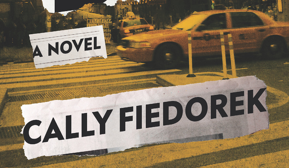
Here is the cover, designed by David Litman.
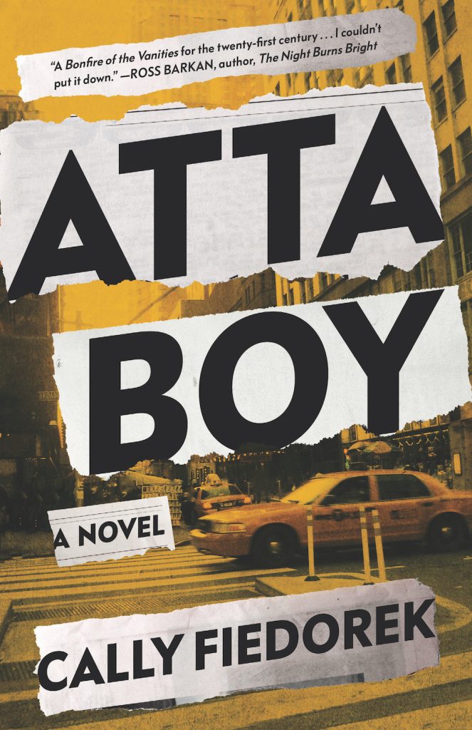
Author Cally Fiedorek: I was a big fan of David Litman’s design before ever thinking he would agree to work on my cover. I had a little “mood board” going, which was fun to assemble; there were a few comps of David’s own recent work, including the cover for Sam Lipsyte’s latest book, plus the cover of a Weegee photo book, Naked City, that I liked. I wanted something pointedly urban, with some big-city glamour to it, but not too on-the-nose—neither self-consciously gritty, nor too cute. Especially with a motif as iconic as the New York City taxicab, there are many opportunities for cheesiness.
David sent me three options, all of which I loved, but in the end I went with the most straightforward of the three. It just felt the most assured and most itself, somehow. I love how unfussy it is. If “unfussy” sounds like faint praise, it is not! The instinct to overdo it is so strong, especially for me, in my writing, and it feels like such a win when you bombard someone with twenty-five references and ideas, and they somehow manage to distill them into something natural, simple, and convincing. Thank you, David!
Designer David Litman: Cally had some great suggestions at the outset that were very helpful. Atta Boy has dual perspectives, as it is both a New York crime story as well as a coming-of-age story, so we wanted to toe the line between gritty noir and youthful or playful. I designed a type treatment that felt mid-century noir but not too on-the-nose. Torn newspaper alludes to the periodicals that occur at intervals throughout the book. The imagery and color scheme hints a central element of the plot: the taxicab industry.