Cover Reveals
Exclusive Cover Reveal of MORE HAPPY LOVE by Joanna Pearson
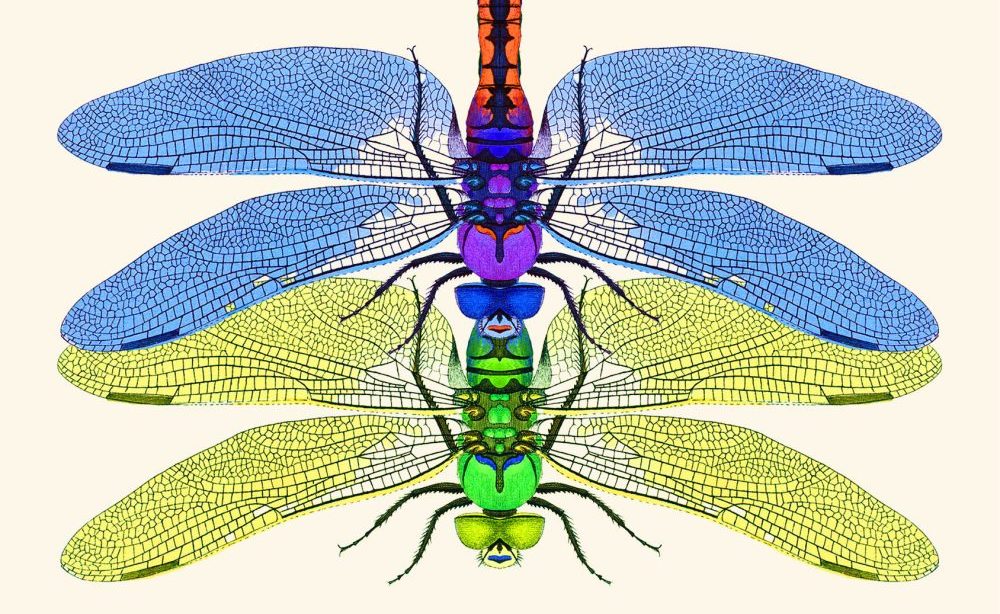
Two dragonflies entwined in jewel-bright symmetry reflect the interweaving desire and danger in these stories
Electric Literature is pleased to reveal the cover of More Happy Love by Joanna Pearson, which will be published on May 18, 2027 by Bloomsbury. You can pre-order your copy here. Read “The Oracle” in Recommended Reading to get a sneak preview!
“Exquisite writer” (Julia Phillips), psychiatrist, and conjurer of the uncanny Joanna Pearson returns to the short story form with virtuosic intensity, insight, and intimacy.
The stories in More Happy Love speak to the many faces of mid-life’s quiet revolt. A psychiatrist meets her late husband’s harshest critic, torn between insatiable lust and vengeance. A timid mother realizes that to save her daughter she must terrorize her. An audiologist begins discovering precious gemstones in the ears of her patients, a surreal mystery that unravels into something much darker. Across the collection, Pearson’s characters grapple with secrets, regrets, and the lingering portraits of who they once were.
The mordant, sexy storytelling of More Happy Love is perfect for fans of Rebecca Lee, Joyce Carol Oates, and Yiyun Li, and its wounded, winning characters will leave readers craving more.
Here is the cover, designed by Myunghee Kwon:

Joanna Pearson: In the way of perfect book covers, never could I have quite described what I hoped for with More Happy Love until I saw this and instantly understood its rightness. Myunghee Kwon is a genius! Like the short stories I most admire, there’s a restraint as well as a sly kind of symmetry to this cover. The gorgeous image of the dragonflies mating is a direct reference to a particular story in the book, but I love how it speaks more broadly to the relational complexities throughout this collection (if you ever want to find a decent analogy in the insect world for the complicated choreography of human sexual relationships, just go read up a bit on dragonfly reproduction!) I also love the tension between the title itself, which is drawn from John Keats’s “Ode on a Grecian Urn,” and the image: permanence and ephemerality! Time’s fleetingness! Myunghee captured it all. And the font (which strikes me as Art Deco?) is the perfect choice to match the dragonflies’ jewel tones.
Myunghee Kwon: The cover was inspired by a pair of dragonflies from the story “Dragonflies.” In the final scene, the mother swats them while they are mating, leaving them locked together even in death. I wanted the cover to evoke both elegance and sensuality, so I created the image of two dragonflies on top of each other. To me, its beauty, sensuality, and underlying bite felt like a perfect visual entry point into a collection where desire and the past remain impossible to disentangle.