
infographics
INFOGRAPHIC: Books and Their Adaptations — Which Do You Prefer?
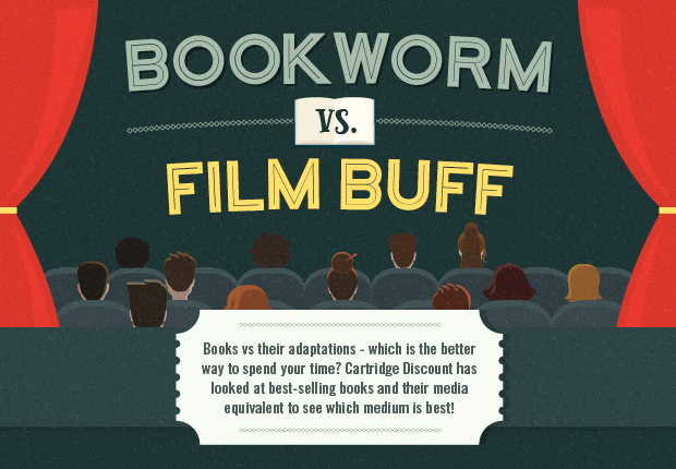
This infographic takes a look at some of the most popular book series of our time, and their consequent adaptations, delving into their ratings on websites such as Goodreads and Rotten Tomatoes, and showing the average reading versus viewing time for the books and TV shows or movies, as well as how much each series and franchise has grossed in its respective formats. The infographic was created by Cartridge Discount.
So, which are you: bookworm for film buff?